Theming and Colors
- Native first — no JS re-implementation of pickers
- Headless-friendly — works with any custom UI
- Codegen-safe — string unions & sentinel values for type safety
- Predictable behavior — no surprise re-renders or layout hacks
- Platform conventions — respects native UX patterns
Theming
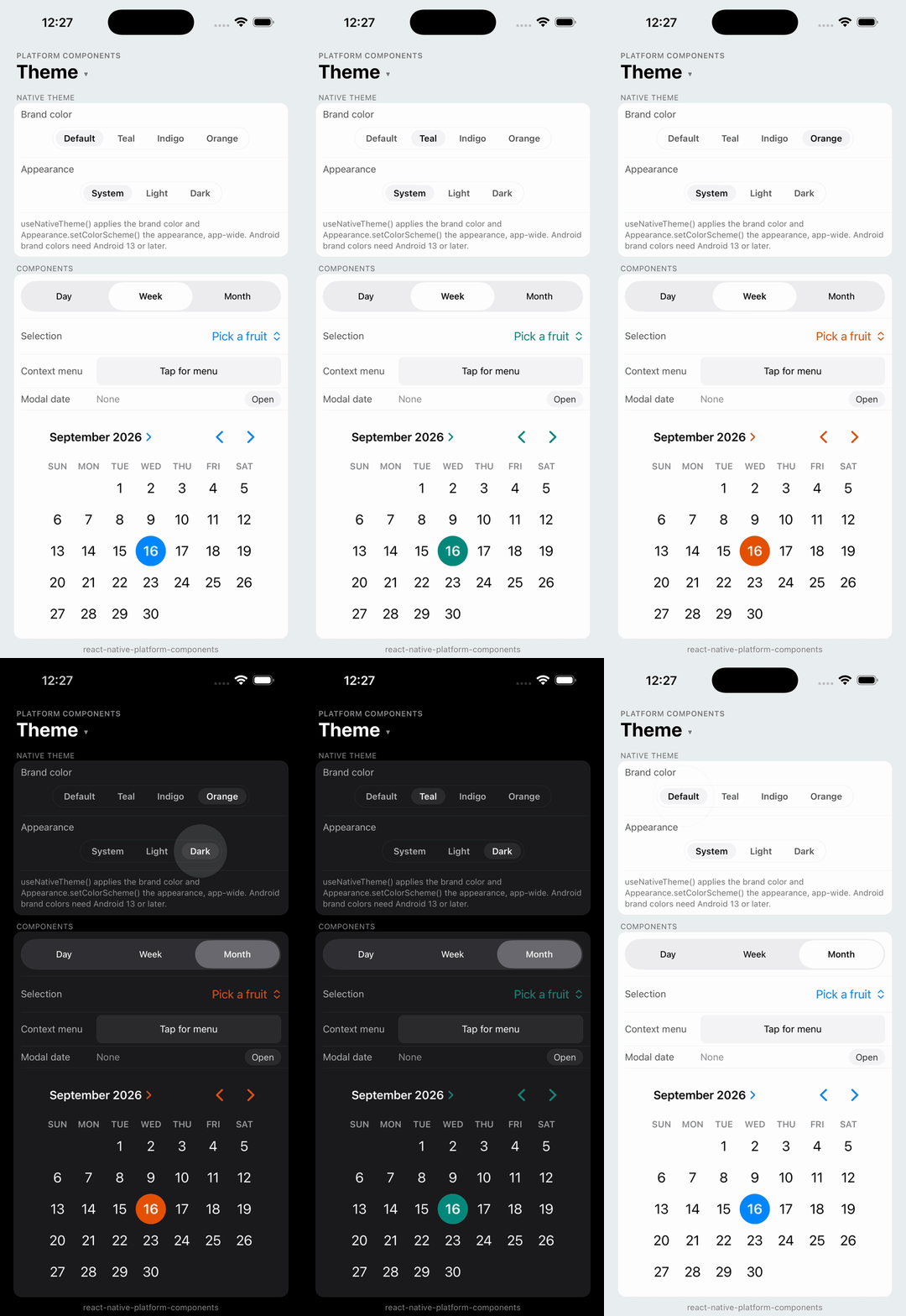
This library does not expose per-component theming props. Components take their appearance from the native platform theme, so they match the rest of the platform UI. You control that theme from JavaScript in two ways: light or dark mode, and a brand color.
- iOS: Components follow the system appearance and use system-defined styles (e.g.,
UIBlurEffectfor menu backgrounds). Controls that use the tint color, such as theDatePickerselection and theSelectionMenulabel, use the brand color. - Android: Components use your app's Material theme. A brand color replaces its colors with a Material 3 color scheme generated from that color.
This is intentional. The goal is native fidelity, not pixel-level customization. If you need custom styling beyond what the platform theme provides, this library may not be the right fit.
Light and dark mode
Components follow the native appearance and update when it changes, including when the app sets it with React Native's Appearance.setColorScheme. If your app has its own light/dark setting, keep the native appearance in sync with it:
import { Appearance } from 'react-native';

// 'light' | 'dark', or 'unspecified' to follow the system again
Appearance.setColorScheme(theme.dark ? 'dark' : 'light');
If your theme already follows the system through useColorScheme(), there is nothing to do. Don't also call setColorScheme with the value it returned: that pins the appearance, and the app stops following system changes.
Brand color
| iOS | Android |
 |
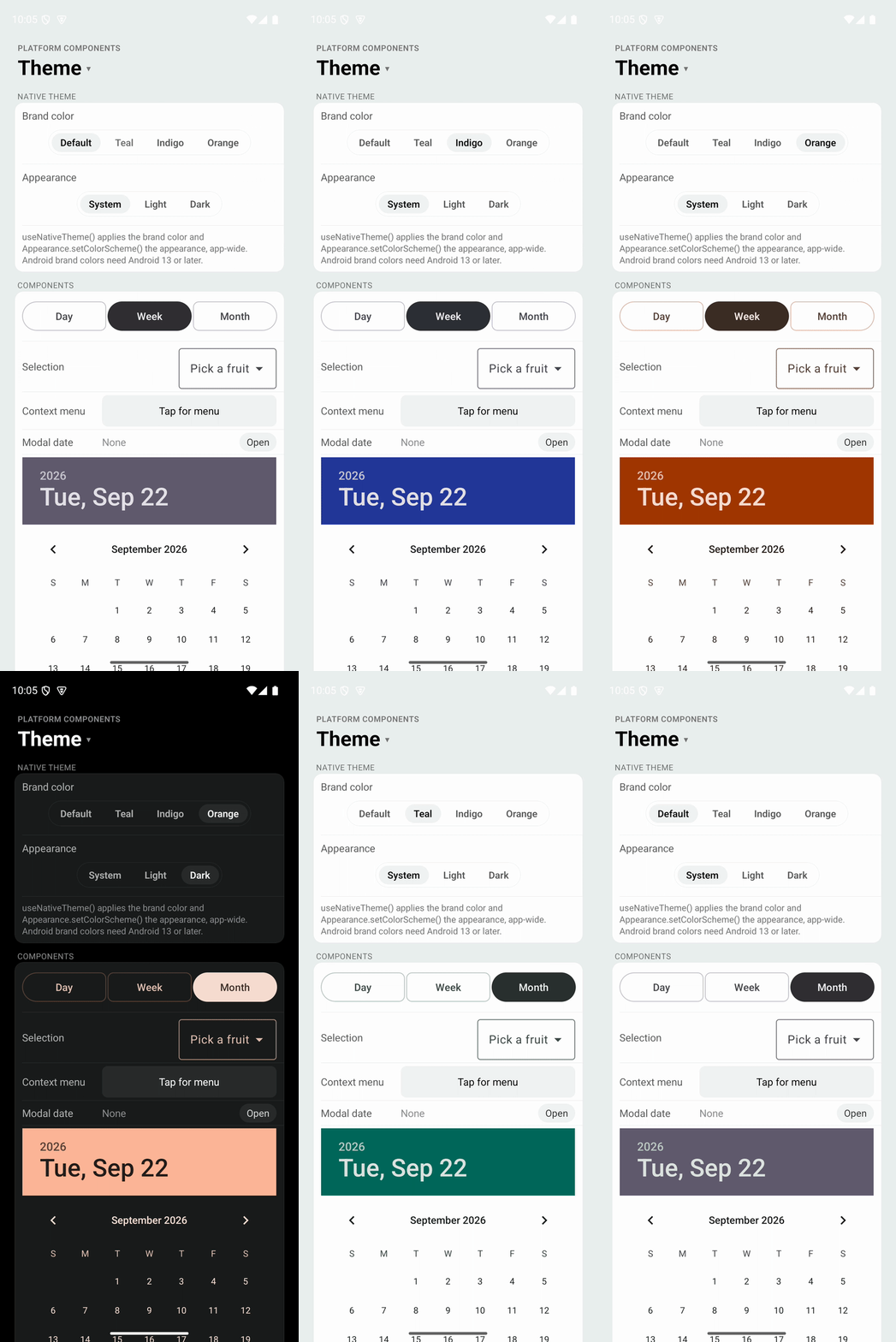 |
useNativeTheme applies your theme's brand color to the native platform theme, app-wide. Call it once, near the root of the app. A React Navigation theme can be passed as is:
import { useColorScheme } from 'react-native';
import {
  DarkTheme,
  DefaultTheme,
  NavigationContainer,
} from '@react-navigation/native';
import { useNativeTheme } from 'react-native-platform-components';

const LightTheme = {
  ...DefaultTheme,
  colors: { ...DefaultTheme.colors, primary: '#00897B' },
};

export default function App() {
  const theme = useColorScheme() === 'dark' ? DarkTheme : LightTheme;
  useNativeTheme(theme);

  return <NavigationContainer theme={theme}>{/* ... */}</NavigationContainer>;
}
Only colors.primary is read. It accepts any color value, including PlatformColor and DynamicColorIOS. Pass null to go back to the app's own theme colors.
- iOS: the color becomes the tint color of every window, including windows opened later. These components and any other UIKit view that uses the tint color inherit it and update right away. Switches keep their green "on" color, as elsewhere on iOS; pass
trackColor={{ true: theme.colors.primary }}to brand a React NativeSwitch. - Android 13 and later: the color seeds a Material 3 color scheme (Material's content-based dynamic color) for the current light or dark mode, applied to the activity.
SegmentedControl,SelectionMenuand bothDatePickermodes use it, and so do other Material and AppCompat widgets, such as React Native'sSwitch. These components rebuild right away; other native views pick up the colors the next time they are created. On older Android versions the app theme's colors stay in place.
To apply the color outside of React, use setNativeTheme:
import { setNativeTheme } from 'react-native-platform-components';

setNativeTheme({ colors: { primary: '#00897B' } });
setNativeTheme(null);
Color Formats
All color props in this library support the same formats as React Native's backgroundColor:
| Format | Example | Description |
|---|---|---|
| Hex | #RGB, #RRGGBB, #RRGGBBAA | Standard hex colors |
| RGB | rgb(255, 0, 0) | RGB values (0-255) |
| RGBA | rgba(255, 0, 0, 0.5) | RGB with alpha (0-1) |
| HSL | hsl(0, 100%, 50%) | Hue (0-360), saturation, lightness |
| HSLA | hsla(0, 100%, 50%, 0.5) | HSL with alpha (0-1) |
| Named | red, steelblue, transparent | CSS named colors |
Props that accept colors:
ContextMenu:imageColor(icon tint)SegmentedControl:selectedSegmentColor,activeTintColor,inactiveTintColor,badgeStyle.backgroundColor,badgeStyle.color,android.rippleColor,android.strokeColor(these also acceptPlatformColor/DynamicColorIOS)LiquidGlass:ios.tintColor,android.fallbackBackgroundColor
// All of these are equivalent
<ContextMenu actions={[{ id: '1', title: 'Red', imageColor: '#FF0000' }]} />
<ContextMenu actions={[{ id: '1', title: 'Red', imageColor: 'rgb(255, 0, 0)' }]} />
<ContextMenu actions={[{ id: '1', title: 'Red', imageColor: 'hsl(0, 100%, 50%)' }]} />
<ContextMenu actions={[{ id: '1', title: 'Red', imageColor: 'red' }]} />