TextField
| iOS | Android |
 |
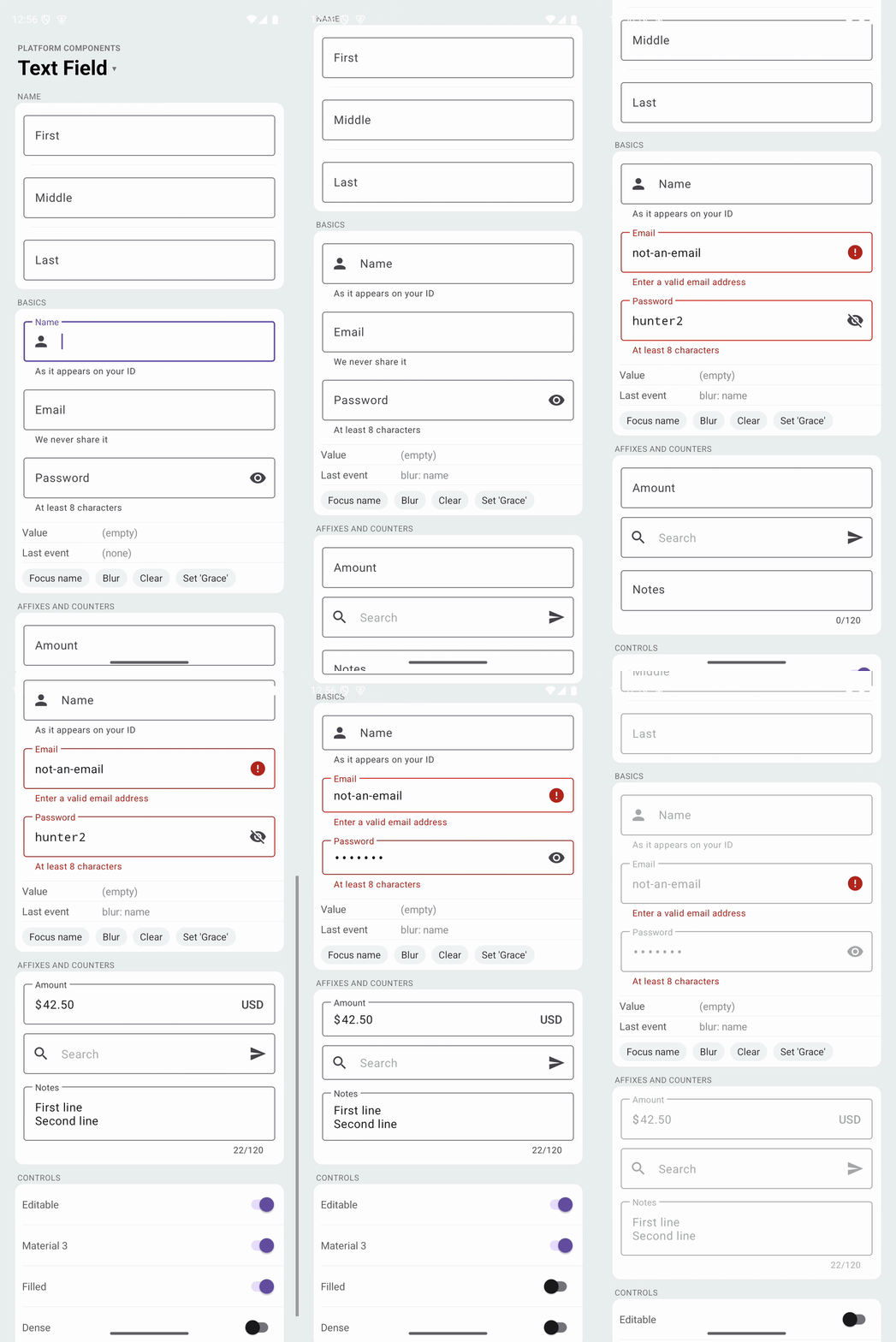 |
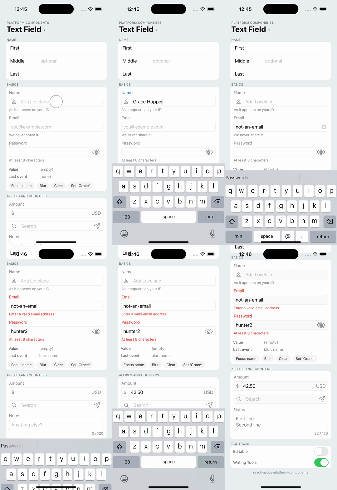
Native text field using TextInputLayout with the Material 3 styles on Android and UITextField (a growing UITextView for multi-line text) on iOS. The whole field is the platform widget, not a TextInput dressed up in JavaScript: Android gets the floating label, the outlined or filled box, supporting text, the error state, start and end icons, prefix and suffix text and the character counter; iOS gets the text traits React Native's TextInput doesn't expose, Writing Tools, inline predictions and smart punctuation among them.
import { TextField } from 'react-native-platform-components';

const [email, setEmail] = useState('');

<TextField
  label="Email"
  placeholder="you@example.com"
  supportingText="We never share it"
  value={email}
  onChangeText={setEmail}
  keyboardType="email-address"
  autoComplete="email"
  autoCapitalize="none"
/>;
The props that exist on React Native's TextInput keep their names and meaning (value, onChangeText, placeholder, secureTextEntry, keyboardType, maxLength, editable, focus() and blur() on the ref), so a field is a change of import. Form libraries that drive value and onChangeText work unchanged.
Props
| Prop | Type | Description |
|---|---|---|
value | string | Controlled text. See Controlled text |
defaultValue | string | Initial text of an uncontrolled field |
onChangeText | (text: string) => void | Called with the new text on every edit |
onChange | (event) => void | Called on every edit with nativeEvent.text and nativeEvent.eventCount |
onFocus, onBlur | (event) => void | Focus changes, with nativeEvent.text |
onSubmitEditing | (event) => void | The return key was pressed (single-line fields). The field blurs |
label | string | Field label. See Label, placeholder and supporting text |
placeholder | string | Shown while the field is empty |
supportingText | string | Helper text below the field |
error | boolean | string | Error state; a string is the message. See Validation |
prefix, suffix | string | Text inside the field before and after the input ($, kg) |
leadingIcon | PlatformIcon | Icon at the start of the field. See Icons |
trailingIcon | PlatformIcon | Icon at the end of the field; pressing it calls onTrailingIconPress |
onTrailingIconPress | () => void | The trailing icon was pressed |
clearButtonMode | 'never' | 'while-editing' | 'unless-editing' | 'always' | A clear button inside the field. Default: 'never' |
passwordToggle | boolean | A button that shows and hides the text of a secureTextEntry field |
showCharacterCount | boolean | Character count below the field, 12 / 100 with maxLength |
maxLength | number | Maximum number of characters |
keyboardType | TextInput values | Keyboard to show. Default: 'default' |
returnKeyType | TextInput values | Return key label. Default: 'default' |
autoCapitalize | 'none' | 'sentences' | 'words' | 'characters' | Default: 'sentences' |
autoCorrect | boolean | Auto-correction and suggestions. Default: true |
secureTextEntry | boolean | Obscures the text |
multiline | boolean | A field that grows with its text. Return inserts a newline |
editable | boolean | Default: true. A non-editable field is drawn disabled |
autoFocus | boolean | Focuses the field when it mounts |
selectTextOnFocus | boolean | Selects all text on focus |
autoComplete | 'email' | 'password' | 'one-time-code' | ... | Autofill hint. See Autofill |
keyboardAppearance | 'default' | 'light' | 'dark' | iOS keyboard appearance |
textStyle | { fontFamily?, fontSize?, fontWeight?, fontStyle? } | Font of the input text |
accessibilityLabel | string | Screen-reader label. Defaults to label |
Ref
| Method | Description |
|---|---|
focus() | Focuses the field and shows the keyboard |
blur() | Removes focus and hides the keyboard |
clear() | Clears the text; onChangeText is called with '' |
isFocused() | Whether the field has focus |
const field = useRef<TextFieldRef>(null);
<TextField ref={field} label="Name" />
<Button label="Edit" onPress={() => field.current?.focus()} />
iOS Props (ios)
The text traits, each 'default' unless set. They apply on the iOS version that introduced them and are ignored before it.
| Prop | Type | Description |
|---|---|---|
writingTools | 'default' | 'complete' | 'limited' | 'none' | Writing Tools (iOS 18): rewrites in place, only the panel, or off |
inlinePrediction | 'default' | 'yes' | 'no' | Inline predictive text (iOS 17) |
smartQuotes | 'default' | 'yes' | 'no' | Smart quotes |
smartDashes | 'default' | 'yes' | 'no' | Smart dashes |
smartInsertDelete | 'default' | 'yes' | 'no' | Spaces around pasted and deleted words |
mathExpressionCompletion | 'default' | 'yes' | 'no' | Math expression completion, 1+1= (iOS 18) |
borderStyle | 'roundedRect' | 'none' | 'line' | 'bezel' | UITextField.borderStyle. Default: 'roundedRect' |
labelPlacement | 'above' | 'leading' | The label above the field (default) or in a leading column. See Grouped forms on iOS |
labelWidth | number | Width of the leading label column, in points. Default: 100 |
Android Props (android)
| Prop | Type | Description |
|---|---|---|
material | 'm3' | 'system' | The Material 3 text field (default) or the platform EditText. See Material style |
variant | 'outlined' | 'filled' | Material 3 text field style. Default: 'outlined'. See Variants |
dense | boolean | The dense variant, a shorter field |
Controlled text
value and onChangeText work like the core TextInput, including under fast typing. Native keeps a counter of user edits and sends it with every onChangeText; a value pushed from JS carries the last counter JS has seen, and native drops it when the user has typed since, so a slow render never erases keystrokes. The edit that follows reconciles the two sides. Formatting as you type (onChangeText={(t) => setValue(t.toUpperCase())}) works, and a field whose owner ignores an edit is reverted to value, as TextInput does.
The field registers with React Native's focus tracking, so Keyboard.dismiss(), a ScrollView's keyboardShouldPersistTaps and KeyboardAvoidingView treat it like a TextInput.
Label, placeholder and supporting text
label is the field's name. On Android it is the Material floating label: inside the box while empty, above the text once focused or filled. On iOS it is a caption above the field that takes the tint color while focused. placeholder is shown inside the empty field (on Android only while focused when there is a label, so the two don't overlap). supportingText sits below the field on both platforms.
<TextField label="Username" placeholder="At least 3 characters" supportingText="Public" />
A field without a label has the placeholder as its only hint and, on Android, the shorter box of a plain field.
Validation
error puts the field in the error state: red outline, label and supporting text on Android, red caption and message on iOS. A string replaces the supporting text with the message; true keeps the supporting text and only changes the colors. On Android the Material error icon takes the end of the field while the error shows, unless the field has a passwordToggle or a trailingIcon, which stay in place.
<TextField
  label="Email"
  value={email}
  onChangeText={setEmail}
  onBlur={() => setTouched(true)}
  error={touched && !isValid(email) ? 'Enter a valid email address' : undefined}
  supportingText="Work address"
/>
Icons
leadingIcon and trailingIcon accept the same shapes as Button: an SF Symbol or drawable name, an image asset, or an { ios, android } pair. The trailing icon is a button; onTrailingIconPress is called when it is pressed.
<TextField
  placeholder="Search"
  leadingIcon={{
    ios: { type: 'sfSymbol', name: 'magnifyingglass' },
    android: { type: 'drawable', name: 'search' },
  }}
  trailingIcon={{
    ios: { type: 'sfSymbol', name: 'paperplane' },
    android: { type: 'drawable', name: 'send' },
  }}
  onTrailingIconPress={search}
  returnKeyType="search"
  onSubmitEditing={search}
/>
The end of the field holds one thing: a trailingIcon, else the passwordToggle, else the clear button. On Android the clear button is the Material clear icon, shown while the focused field has text, whatever clearButtonMode says beyond 'never'. Multi-line fields have no icons, prefix or suffix on iOS, where a UITextView has no accessory slots.
Passwords
<TextField
  label="Password"
  secureTextEntry
  passwordToggle
  autoComplete="new-password"
  value={password}
  onChangeText={setPassword}
/>
passwordToggle adds the Material password toggle on Android and an eye button on iOS. autoComplete="password" and "new-password" enable the platform password managers; "one-time-code" offers codes from incoming messages.
Autofill
autoComplete maps to Android autofill hints and to textContentType on iOS: off, username, password, new-password, one-time-code, email, name, given-name, family-name, tel, street-address, postal-code, country, cc-number, cc-exp, cc-csc, url.
Multi-line text
<TextField label="Notes" multiline maxLength={200} showCharacterCount />
A multi-line field grows with its text; give it a minHeight style for a taller box. The return key inserts a newline, so onSubmitEditing is not called.
Grouped forms on iOS
Apple's own forms (Contacts, Settings) put the label in a column at the left and a borderless field beside it, one row per field inside a rounded group. That is the same UITextField in a list cell layout; ios.labelPlacement: 'leading' with ios.borderStyle: 'none' gives the row, and your own grouped container with hairline separators gives the card. Rows in one group share a labelWidth so the fields line up. Android keeps its Material fields, so the same code is a stack of outlined fields there.
const row = { ios: { labelPlacement: 'leading', borderStyle: 'none' } } as const;

<View style={styles.group}>
  <TextField label="First" value={first} onChangeText={setFirst} {...row} />
  <Divider />
  <TextField label="Middle" placeholder="optional" value={middle} onChangeText={setMiddle} {...row} />
  <Divider />
  <TextField label="Last" value={last} onChangeText={setLast} {...row} />
</View>
Variants
Material 3 has two text field styles, both on android.variant: 'outlined' (the default) draws a stroke around the box, 'filled' a tinted container with a bottom line. android.dense picks the shorter, dense version of either. iOS has one field; ios.borderStyle chooses between the rounded rectangle and the other UITextField borders.
<TextField label="Filled" android={{ variant: 'filled' }} />
<TextField label="Dense" android={{ dense: true }} />
Material style
android.material is the same preference as on DatePicker and SelectionMenu: 'm3' (the default here) is the Material 3 TextInputLayout; 'system' is the platform EditText, the AppCompat widget with the underline, for screens that keep the system look. The system field shows one hint (the placeholder, else the label), the supporting or error text on a line below and the icons as compound drawables; it has no floating label, box, clear button, password toggle, counter, prefix or suffix. variant and dense only apply to the Material field.
<TextField label="Email" supportingText="Work address" android={{ material: 'system' }} />
Styling
textStyle sets the input font with the Text style conventions; the label, supporting text and counter keep the platform's typography (Dynamic Type on iOS). Colors come from the theme: the app's Material 3 theme or the brand color set with useNativeTheme on Android, the tint color on iOS.
Android theme
The field is a Material 3 widget, so it works with a Theme.Material3 app theme and with the library's Material 3 fallback; see Android Theme Configuration.