ProgressIndicator
| iOS | Android |
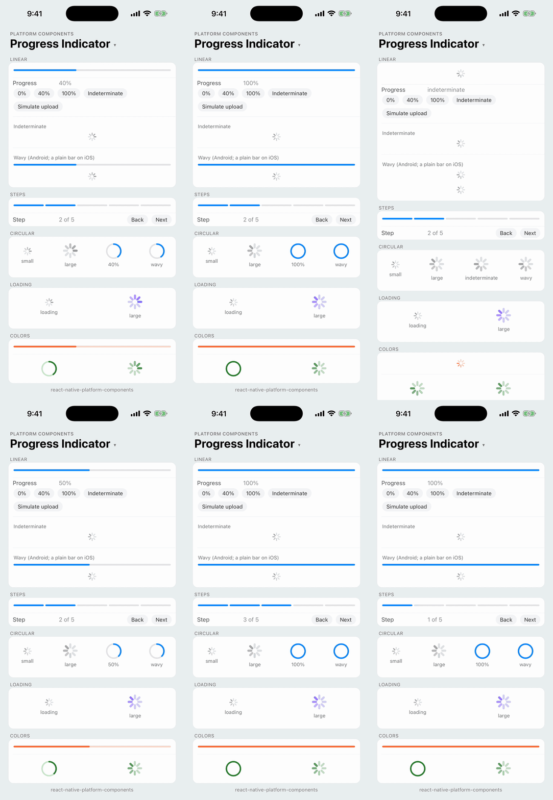 |
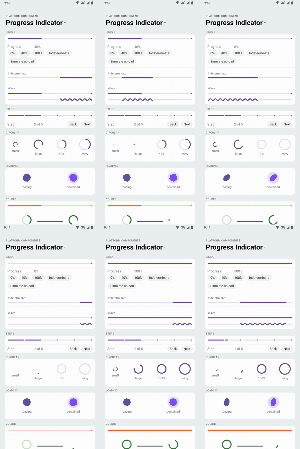 |
Shows how far along a task is, or that something is in progress. One component covers the bar, the spinner and Material 3 Expressive's loading indicator:
- Android: Material 3
LinearProgressIndicatorandCircularProgressIndicator, with the Material 3 Expressive wavy shape (android.wavy), and the ExpressiveLoadingIndicator(the morphing shape) forvariant="loading". - iOS:
UIProgressViewfor a determinate bar andUIActivityIndicatorViewfor indeterminate progress. See iOS for the cases UIKit has no control for. - Web: the browser's
<progress>for a bar, and a CSS ring for the circular and loading variants.
| iOS 26 | Android |
|---|---|
 |  |
import { ProgressIndicator } from 'react-native-platform-components';

// A job's progress: determinate, animates as `progress` changes
<ProgressIndicator progress={uploaded / total} accessibilityLabel="Uploading photos" />

// A wait of unknown length: leave `progress` out
<ProgressIndicator variant="circular" accessibilityLabel="Loading" />

// The Material 3 Expressive loading indicator (the spinner on iOS)
<ProgressIndicator variant="loading" accessibilityLabel="Loading" />
Props
| Prop | Type | Description |
|---|---|---|
variant | 'linear' | 'circular' | 'loading' | See Variants. Default: 'linear' |
progress | number | Progress from 0 to 1, clamped. Omit it (or pass undefined) for an indeterminate indicator. Changes animate. Ignored by loading |
color | ColorValue | Indicator color. Default: the platform's (Material primary; the tint color for iOS bars and rings, gray for the iOS spinner) |
trackColor | ColorValue | Track color, the unfilled part. On Android, a loading indicator takes it as its container color (the contained loading indicator) |
size | 'small' | 'large' | Size of a circular indicator (and of the iOS spinner for loading). See Sizes |
segments | number | Splits a determinate linear bar into this many segments, for step progress. See Steps |
accessibilityLabel | string | Screen-reader label. The progress is read out as the value |
android.wavy | boolean | The Material 3 Expressive wavy indicator. See Wavy. Default: false |
testID | string | Test identifier, on the view that carries the label and value |
The component is a view in your layout: style sizes and places it (see Layout).
Variants
variant | Android | iOS |
|---|---|---|
'linear' | LinearProgressIndicator | UIProgressView; while indeterminate, UIActivityIndicatorView (iOS has no indeterminate bar) |
'circular' | CircularProgressIndicator | UIActivityIndicatorView while indeterminate; a ring when determinate (see iOS) |
'loading' | Material 3 Expressive LoadingIndicator, always indeterminate | UIActivityIndicatorView (iOS has no loading indicator) |
Material 3 Expressive recommends the loading indicator for short waits that would otherwise show a circular spinner, such as a screen or a list loading, and progress indicators for tasks whose progress you know.
Switching progress between a number and undefined changes the indicator in place. On Android, Material finishes the current indeterminate cycle before it shows the value.
Sizes
size follows each platform's own sizes, so the same name gives a slightly different diameter on each:
size | iOS | Android |
|---|---|---|
'small' | 20pt, UIActivityIndicatorView.Style.medium (iOS's default) | 20dp ring in a 24dp view: Material's extra-small circular indicator (2.5dp track) |
'large' | 37pt, UIActivityIndicatorView.Style.large | 40dp ring in a 48dp view: Material's default circular indicator (4dp track); 48dp wavy |
Leaving size out gives each platform's default: small on iOS and large on Android. Material also has a 28dp size between the two, which has no iOS counterpart and isn't offered. A style width and height larger or smaller than the named size resize a determinate ring on iOS and the circular and loading indicators on Android; the iOS spinner keeps its system size, centered.
The Android LoadingIndicator is 48dp (a 34dp shape in a 48dp container, Material's size) and scales with the view's style size.
Steps
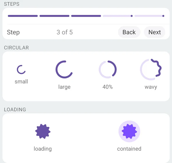
segments splits a determinate bar into that many native bars in a row, 4pt (dp) apart, for step progress such as a checkout's or an onboarding flow's steps. Segment i fills as progress passes i / segments, so progress={step / steps} fills one segment per completed step:
<ProgressIndicator
  progress={step / 5}
  segments={5}
  accessibilityLabel="Checkout"
  accessibilityValue={{ text: `Step ${step} of 5` }}
/>
On Android each segment is a LinearProgressIndicator with Material 3's stop indicator, the dot at the end of its track, which marks the end of each step until the segment fills. segments applies to determinate linear bars only; an indeterminate bar is one bar.
| iOS 26 | Android |
|---|---|
 |  |
Wavy (Android)
android={{ wavy: true }} draws the active part of a linear or circular indicator as a wave, the Material 3 Expressive look. The wave uses the Expressive tokens: a 3dp amplitude and 40dp wavelength (20dp indeterminate) for bars, a 1.6dp amplitude and 15dp wavelength for the circular indicator, which grows to 48dp. A wavy bar is 10dp tall (the 4dp track plus the amplitude on each side). iOS has no wavy indicator and ignores the prop.
| Android |
|---|
 |
Colors
color sets the indicator and trackColor the track:
- Android:
setIndicatorColorandsetTrackColor(the stop indicator takes the indicator color). Forloading,coloris the shape's color andtrackColorits container: set it for Material's contained loading indicator. Without them, the indicators use the theme's colors, including a brand color fromuseNativeTheme. - iOS: a bar's
progressTintColorandtrackTintColor, the spinner'scolor(it has no track), and the ring's arc and track. Without them, bars and rings use the tint color over the system fill, and the spinner its gray.
| iOS 26 | Android |
|---|---|
 |  |
iOS
UIKit doesn't have every indicator Material has:
- Indeterminate bar:
UIProgressViewis determinate only, and SwiftUI's indeterminateProgressViewis the spinner too. An indeterminatelinearindicator showsUIActivityIndicatorView, centered across the bar's width, and the view is 20pt tall while it does (a bar is 4pt). Give the view a fixedstyle.heightif the layout mustn't move when the progress becomes known. - Determinate circle: UIKit has none, and SwiftUI's circular
ProgressViewignores its value on iOS (it shows the spinner). A determinatecircularindicator is a ring the library draws with Core Animation in the system colors: the tint color over the system fill, asUIProgressViewuses, with round caps, its line a tenth of the diameter. (SwiftUI'sGaugewith theaccessoryCircularCapacitystyle draws a determinate ring, but it's a Lock Screen widget style with a fixed 58pt size and no track color.) - Loading indicator: Material 3 Expressive's morphing shape has no iOS counterpart;
loadingis the spinner.
Layout
The view has a default size from the platform, which style overrides:
| iOS | Android | |
|---|---|---|
linear | 4pt tall (20pt while indeterminate); the width of its container | 4dp tall, 10dp wavy; the width of its container |
circular | 20pt or 37pt square | 24dp or 48dp square |
loading | as circular | 48dp square |
A bar stretches across a column; in a row, give it flex: 1 or a width. Indicators are centered in a larger view.
Accessibility
The view with the testID is the accessibility element. It has the progressbar role, the accessibilityLabel, and the progress as its value: accessibilityValue={{ min: 0, max: 100, now }}, read out as a percentage (VoiceOver) or as the progress bar's range (TalkBack). While indeterminate it has no value; on iOS and the web it is busy (accessibilityState.busy, read out as "busy"). Android leaves the busy state out, because React Native writes it into the content description there ("Loading, busy"), which would change the label tests find it by; TalkBack announces it as a progress bar.
The native controls inside are hidden from VoiceOver and TalkBack, so the indicator is announced once. Pass your own accessibilityValue (for example { text: 'Step 2 of 5' }) to replace the percentage.
Testing
testID, the label and the value are on one native view, so Detox can find the indicator by ID and check its label:
await expect(element(by.id('upload-progress'))).toHaveLabel('Uploading photos');
// iOS: the value as VoiceOver reads it
await expect(element(by.id('upload-progress'))).toHaveValue('40%');
On Android Detox doesn't report the numeric value. A text value (accessibilityValue={{ text }}) is different: React Native appends it to the content description there, so the label Detox sees is "Checkout, Step 2 of 5".
In Jest, the mock renders a view with the progressbar role, the label and the accessibilityValue.
Android theme
The indicators are Material widgets built from the app's Material theme, so they take your colors and follow useNativeTheme. With an AppCompat theme they fall back to Material 3 defaults and log one warning, like the other Material components (see Android Theme Configuration). The wavy indicators and LoadingIndicator come from Material Components for Android 1.13+; the library depends on 1.14.0.