SegmentedControl
| iOS | Android |
 |
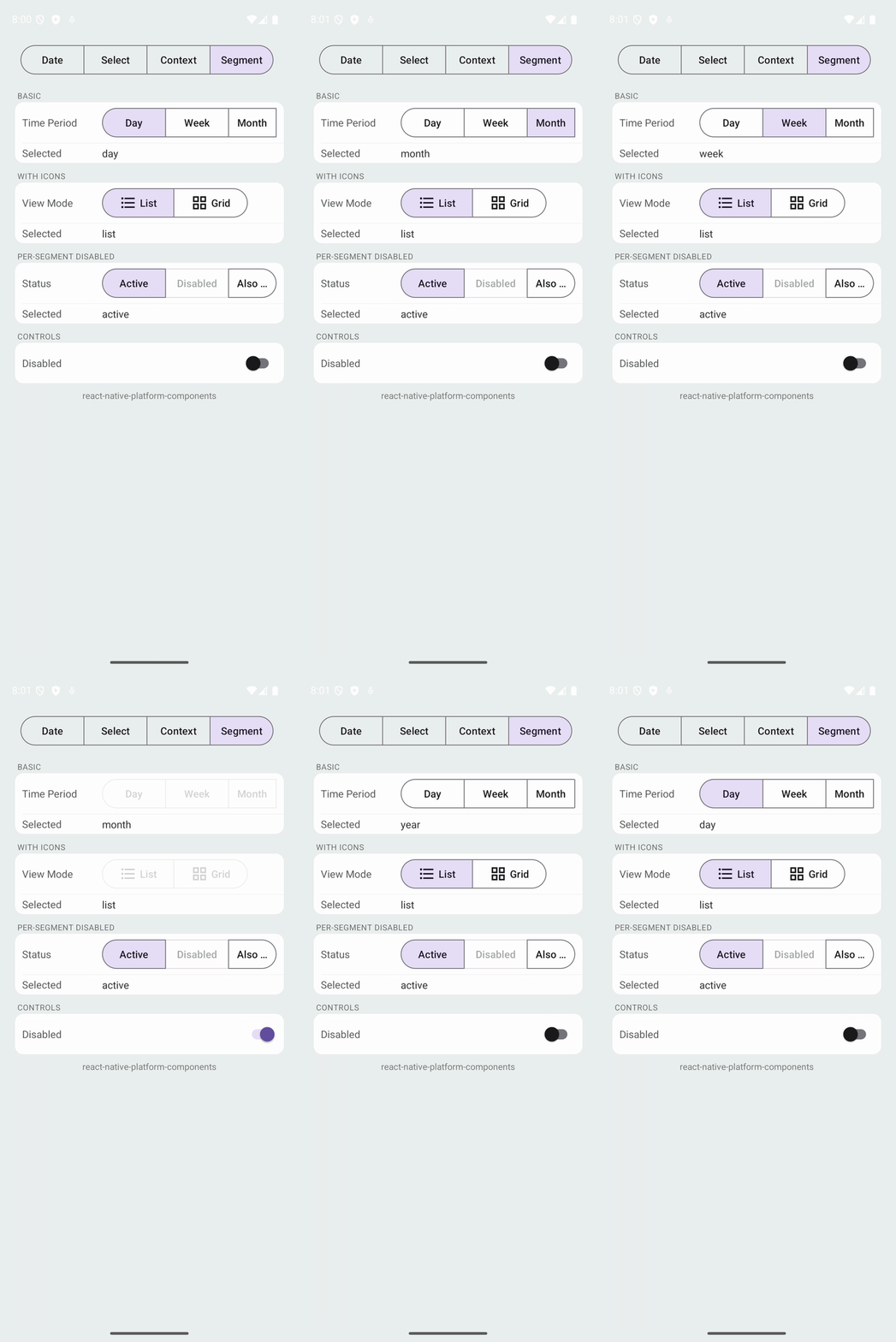 |
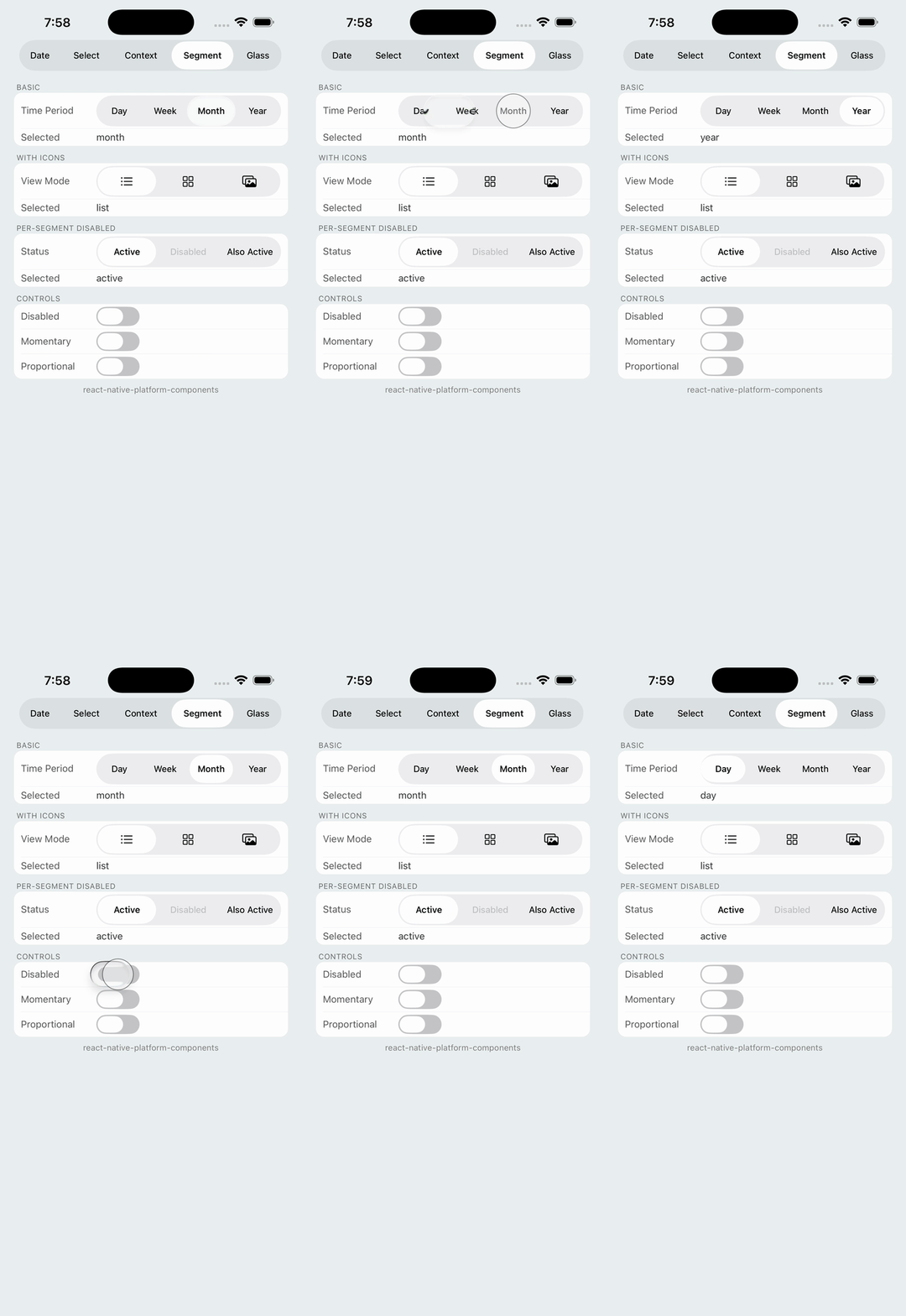
Native segmented control using UISegmentedControl on iOS and MaterialButtonToggleGroup on Android.
Props
| Prop | Type | Description |
|---|---|---|
segments | SegmentedControlSegment[] | Array of segments to display |
selectedValue | string | null | Currently selected segment's value |
disabled | boolean | Disables the entire control |
labelVisibility | 'auto' | 'labeled' | 'unlabeled' | How labels and icons combine. See Label visibility. Default: 'auto' |
selectedSegmentColor | ColorValue | Background of the selected segment |
activeTintColor | ColorValue | Text and icon color of the selected segment |
inactiveTintColor | ColorValue | Text and icon color of unselected segments |
labelStyle | { fontFamily?, fontSize?, fontWeight?, fontStyle? } | Font for segment labels. See Styling |
badgeStyle | { backgroundColor?, color? } | Colors for segment badges. See Badges |
onSelect | (value: string, index: number) => void | Called when user selects a segment |
onDeselect | () => void | Called when the user clears the selection by tapping the selected segment. Android only; requires android.selectionRequired: false |
SegmentedControlSegment
| Property | Type | Description |
|---|---|---|
label | string | Display text for the segment |
value | string | Unique value returned in callbacks |
disabled | boolean | Disables this specific segment |
icon | SegmentedControlIcon | Optional icon. See Icon Support |
badge | string | number | Badge at the segment's top-right corner, e.g. an unread count. See Badges |
accessibilityLabel | string | Screen-reader label. Defaults to label. On iOS it applies to icon segments; text segments announce their title |
iOS Props (ios)
| Prop | Type | Description |
|---|---|---|
momentary | boolean | If true, segments don't show selected state |
apportionsSegmentWidthsByContent | boolean | If true, segment widths are proportional to content |
selectedSegmentTintColor | string | Deprecated. Use selectedSegmentColor, which works on both platforms. |
Android Props (android)
| Prop | Type | Description |
|---|---|---|
selectionRequired | boolean | If true (default), one segment must always be selected. Set to false to let a tap on the selected segment clear it and fire onDeselect. |
rippleColor | ColorValue | Ripple shown while pressing a segment |
strokeColor | ColorValue | Outline color of the segments |
material | 'm3' | 'expressive' | Material style: the Material 3 Expressive connected buttons (default), or the classic Material 3 segmented buttons. See Material style |
Material style
On Android the control is a MaterialButtonToggleGroup. By default it uses the Material 3 Expressive connected button group styles: a hairline gap between segments, small inner corners, and the selected segment rounding into a pill, matching ButtonGroup. Pass android={{ material: 'm3' }} for the classic Material 3 segmented buttons (a shared outline, no gaps).
<SegmentedControl segments={segments} selectedValue={selected} onSelect={setSelected} android={{ material: 'm3' }} />
Before 1.4.0 the classic look was the only one; set
material: 'm3'to keep it.
Icon Support
icon accepts a single source, or an { ios, android } pair so you never branch on Platform.OS:
| Shape | iOS | Android |
|---|---|---|
'name' (string) | SF Symbol name | Drawable resource name |
{ type: 'sfSymbol', name } | SF Symbol | Ignored (segment shows its label) |
{ type: 'drawable', name } | Ignored (segment shows its label) | Drawable from res/drawable |
{ type: 'image', source, tinted? } | Image asset or { uri } | Image asset or { uri } |
{ ios: <source>, android: <source> } | Uses ios | Uses android |
// A bundled asset works everywhere and is tinted like a template.
icon: { type: 'image', source: require('./icons/bell.png') }

// Keep the original colors of a full-color image.
icon: { type: 'image', source: require('./icons/logo.png'), tinted: false }

// Remote images load asynchronously; pass `scale` for @2x/@3x artwork.
icon: { type: 'image', source: { uri: 'https://example.com/icon@2x.png', scale: 2 } }
Image icons render at their point size, so ship @2x / @3x variants sized around 18–22 points. Local assets load synchronously in release builds; in development they stream from Metro and the segment shows its label until the image arrives.
Label visibility
UISegmentedControl shows either a title or an image per segment, while Material buttons can show both. labelVisibility makes the outcome predictable:
| Value | iOS | Android |
|---|---|---|
'auto' (default) | Icon when the segment has one, else label | Icon and label |
'labeled' | Label only (icon is not shown) | Icon and label |
'unlabeled' | Icon when the segment has one, else label | Icon only, else label |
Screen readers announce the label (or accessibilityLabel) in every mode on both platforms.
Styling
Colors take any React Native ColorValue (hex, rgba(), named colors, PlatformColor, DynamicColorIOS). Fonts follow the Text style conventions, and each field falls back to the platform default.
<SegmentedControl
  segments={segments}
  selectedValue={selected}
  onSelect={setSelected}
  selectedSegmentColor="#FF6B35"
  activeTintColor="white"
  inactiveTintColor="#8E8E93"
  labelStyle={{ fontWeight: '700', fontSize: 14 }}
  android={{ rippleColor: 'rgba(255, 107, 53, 0.25)', strokeColor: '#FF6B35' }}
/>
| Prop | iOS | Android |
|---|---|---|
selectedSegmentColor | selectedSegmentTintColor (the pill) | Checked button background |
activeTintColor | Selected title / template image color | Checked button text and icon tint |
inactiveTintColor | Normal title / template image color | Unchecked button text and icon tint |
labelStyle | Title font (default: 13pt system) | Button typeface and size (default: theme) |
android.rippleColor | — | Press ripple |
android.strokeColor | — | Button outline |
Images with tinted: false keep their own colors and ignore the tint props.
Badges
Give a segment a badge to show a count or short status at its top-right corner. Numbers render as-is, so format them yourself ('99+'); undefined hides the badge.
<SegmentedControl
  segments={[
    { label: 'Inbox', value: 'inbox', badge: unreadCount || undefined },
    { label: 'Sent', value: 'sent' },
    { label: 'Drafts', value: 'drafts', badge: 'new' },
  ]}
  selectedValue={mailbox}
  onSelect={setMailbox}
  badgeStyle={{ backgroundColor: '#5856D6', color: 'white' }}
/>
- iOS: a capsule label drawn over the segment (UISegmentedControl has no badge API). Defaults to system red with white text.
- Android: a Material
BadgeDrawableattached to the button. Defaults to the theme's error color. - Screen readers announce the badge with the segment label ("Inbox, 3").