GlassDisclosure
| iOS | Android |
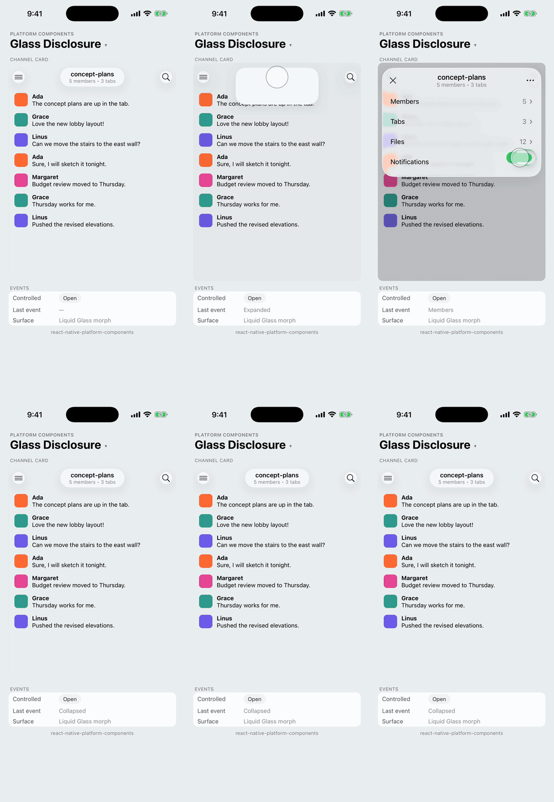 |
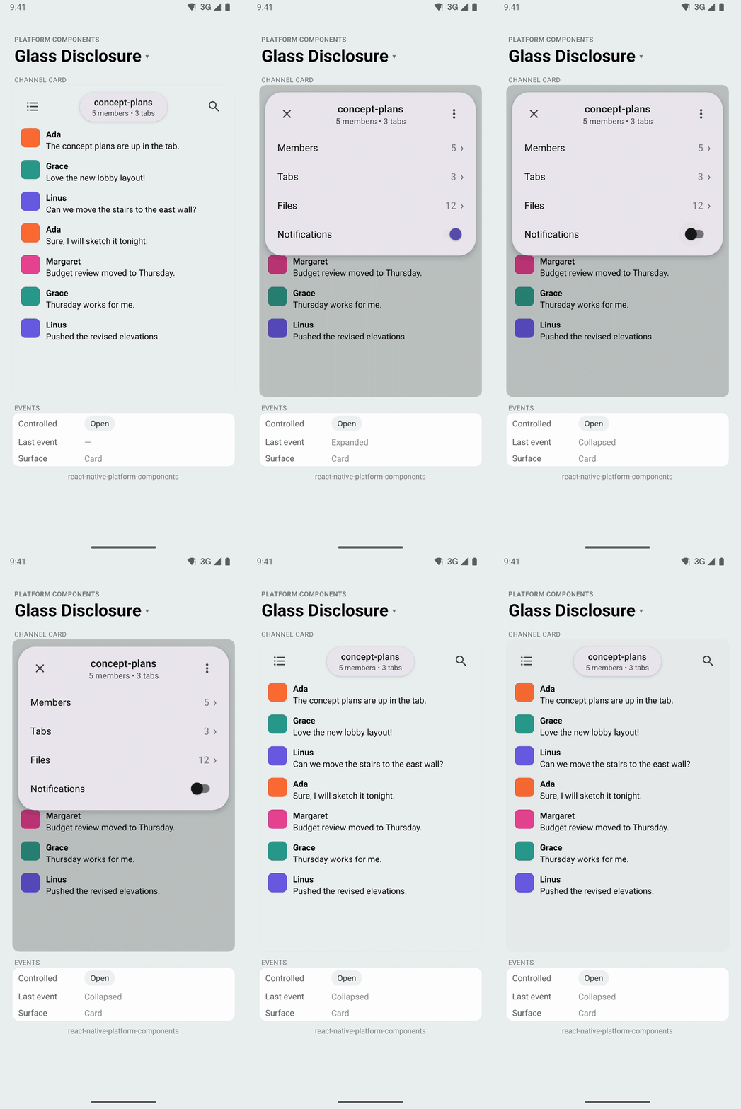 |
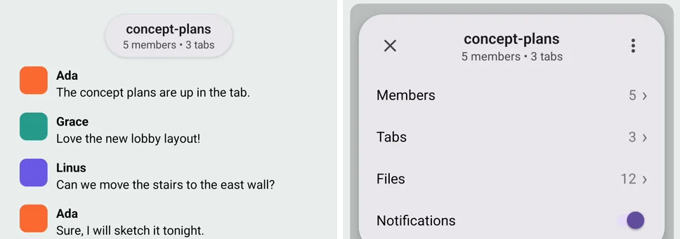
A pill with a title and subtitle that opens into a panel of any React content, like the channel card at the top of a chat app. On iOS 26 the pill and the panel are one Liquid Glass shape: it grows out of the pill and shrinks back into it. The content fades in once the glass has started to grow, and out before it shrinks.
Use it for what a ContextMenu can't draw: a header with buttons, values laid out at the end of a row, switches, a search field, a list with chevrons. When a menu is enough, use the menu.
import { Button, GlassDisclosure } from 'react-native-platform-components';

function ChannelScreen() {
  const [open, setOpen] = useState(false);
  const insets = useSafeAreaInsets();

  return (
    <View style={{ flex: 1 }}>
      <MessageList />

      {/* Last, so it covers the screen */}
      <GlassDisclosure
        style={{ paddingTop: insets.top + 8, paddingHorizontal: 12 }}
        expanded={open}
        onExpandedChange={setOpen}
        title="concept-plans"
        subtitle="5 members • 3 tabs"
        headerRight={
          <Button
            icon="ellipsis"
            variant="glass"
            shape="round"
            accessibilityLabel="More"
            menu={[{ id: 'leave', title: 'Leave channel' }]}
            onMenuSelect={leave}
          />
        }
      >
        <Row label="Members" value="5" onPress={showMembers} />
        <Row label="Tabs" value="3" onPress={showTabs} />
        <Switch value={notify} onValueChange={setNotify} />
      </GlassDisclosure>
    </View>
  );
}
Placement
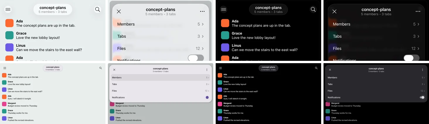
The component fills its parent (StyleSheet.absoluteFill) and is transparent to touches while the pill is closed: only the pill takes them. Nothing it draws reaches past the closed pill, so views beside the pill, such as a screen header's buttons, stay tappable and visible to UI tests (Detox toBeVisible()). The pill sits at the top, centered, and the panel opens down from there across the full width. Pad the component through style to place them: the safe area at the top, the screen's margins at the sides.
Render it last in a screen-sized parent. The backdrop behind the open panel covers that parent, and a React Native view can't take touches outside its parent, so a GlassDisclosure inside a small view can only dim and dismiss from that view.
| In a screen header: the pill between the header's buttons, then open over them. iOS 26 (top) and Android (bottom), light and dark |
|---|
 |
Props
| Prop | Type | Description |
|---|---|---|
expanded | boolean | Whether the panel is open. Controlled |
onExpandedChange | (expanded: boolean) => void | true when the pill is tapped; false from the close button, the backdrop, Android back or VoiceOver's escape gesture |
title | string | Shown in the pill and the panel's header |
subtitle | string | Second line under the title |
headerRight | ReactNode | Trailing content of the panel's header, such as a Button with a menu. The close button leads |
children | ReactNode | The panel's content, under the header |
style | ViewStyle | The overlay the component fills. Default: all of its parent. Pad it to place the pill and the panel |
panelStyle | ViewStyle | Style of the open panel, such as maxHeight or padding |
backdropColor | ColorValue | Color of the layer behind the panel. Default: black at 20% |
closeAccessibilityLabel | string | Screen-reader label of the close button. Default: 'Close' |
fallbackColor | ColorValue | Color of the pill and the panel where there is no Liquid Glass. Default: the platform's surface |
testID | string | Test identifier. The parts get suffixes: -pill, -panel, -close, -backdrop |
iOS Props (ios)
| Prop | Type | Description |
|---|---|---|
effect | 'regular' | 'clear' | Glass style on iOS 26. Default: 'regular' |
tintColor | string | Tint color of the glass on iOS 26 |
colorScheme | 'light' | 'dark' | 'system' | Forces a light or dark glass. Default: 'system' |
Platform behavior
| Platform | Pill and panel |
|---|---|
| iOS 26+ | One UIGlassEffect in a UIGlassContainerEffect: its frame and corners spring from a capsule to the panel's concentric corners (0.45 s) |
| iOS 26+, Reduce Motion | A glass capsule, and a glass panel that fades in over it instead of the morph |
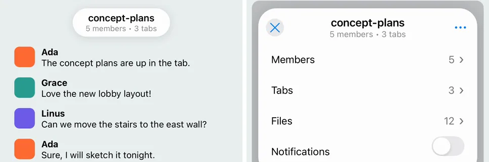
| iOS 15 – 18 | A capsule and a card in secondarySystemGroupedBackground; the card fades and scales in from the pill's top |
| Android | A capsule and a Material 3 card in colorSurfaceContainerHigh, with elevation; the card fades and scales in |
| Web | As Android, in the page's Canvas color; Escape also closes it |
| iOS 26: the capsule grows into the panel, and the content fades in once the glass has grown |
|---|
 |
| iOS 18 (closed, open) | Android (closed, open) |
|---|---|
 |  |
Content
The panel sizes to its content. It has 12 points of padding and the header; change the padding with panelStyle. For content that can be taller than the screen, give the panel a maxHeight and put the content in a ScrollView:
<GlassDisclosure panelStyle={{ maxHeight: 480 }} ...>
  <ScrollView>{members.map(renderMember)}</ScrollView>
</GlassDisclosure>
On iOS 26 the content is clipped to the glass while it grows, so it shows only as far as the glass has reached.
Dismissal
The panel asks to close (onExpandedChange(false)) when the user:
- taps the close button at the start of the header;
- taps the backdrop around the panel;
- presses back on Android;
- makes VoiceOver's escape gesture (a two-finger Z) on iOS;
- presses Escape on web.
The component never closes itself: like a Modal, it stays open until expanded becomes false.
Accessibility
- The pill is a button with an expanded state (
accessibilityState.expanded) and the title and subtitle as its label. - When the panel opens, screen-reader focus moves to its header; when it closes, focus goes back to the pill.
- While the panel is open the component is modal for VoiceOver (
accessibilityViewIsModal), so VoiceOver ignores the views beside it. On Android, TalkBack can still reach the screen behind the backdrop: hide it withimportantForAccessibility="no-hide-descendants"while the panel is open if that matters. - Reduce Motion replaces the morph with a crossfade, and drops the card's scale.
Testing
The Jest mock renders the pill as a button (<testID>-pill) and, while expanded, the panel (<testID>-panel) with the close button (<testID>-close), headerRight and the children, without animation.