FloatingToolbar
| iOS | Android |
 |
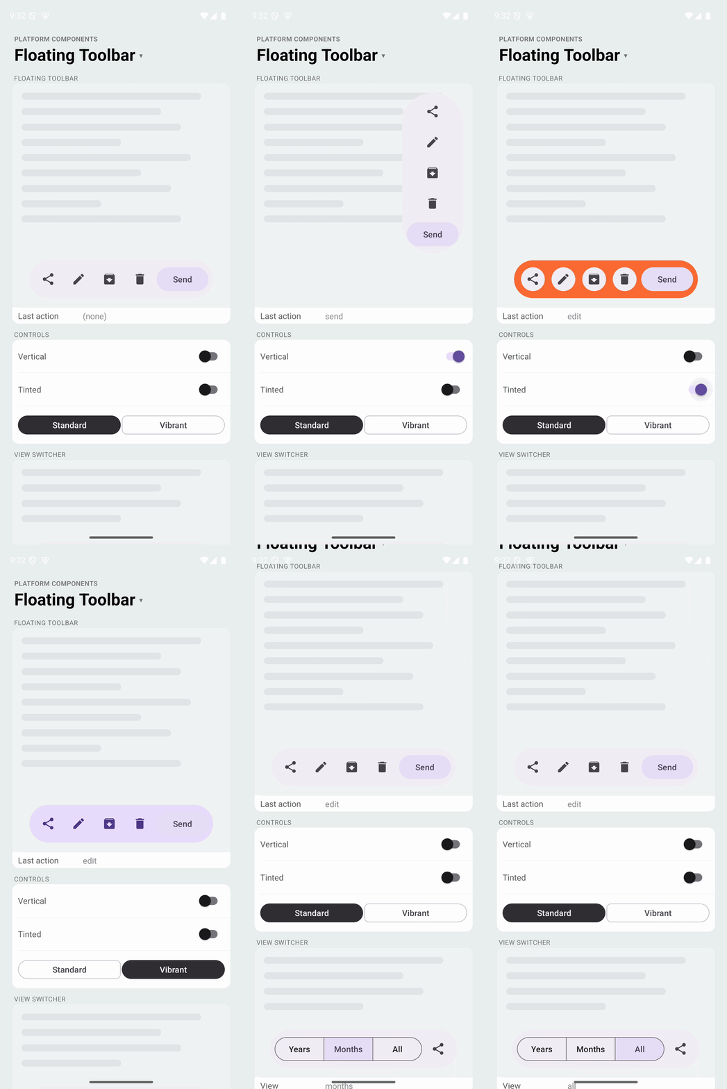 |
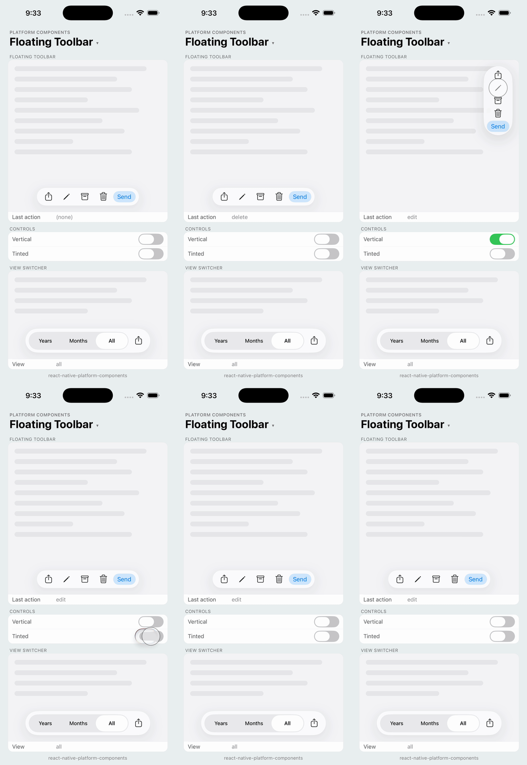
A toolbar that floats above the content, using FloatingToolbarLayout (Material 3 Expressive) on Android and a capsule of UIGlassEffect on iOS 26 (a blur material with a soft shadow on earlier versions). The toolbar is a container: put Buttons, or anything else, inside it and position it with a style.
import { Button, FloatingToolbar } from 'react-native-platform-components';

<View style={{ flex: 1 }}>
  {/* content */}

  <FloatingToolbar style={{ position: 'absolute', bottom: 24 }}>
    <Button icon="square.and.arrow.up" variant="text" accessibilityLabel="Share" onPress={share} />
    <Button icon="pencil" variant="text" accessibilityLabel="Edit" onPress={edit} />
    <Button icon="trash" variant="text" accessibilityLabel="Delete" onPress={remove} />
    <Button label="Send" variant="tonal" onPress={send} />
  </FloatingToolbar>
</View>
The toolbar centers itself horizontally (alignSelf: 'center') and adds the Material padding and gap; override any of it through style.
Props
| Prop | Type | Description |
|---|---|---|
orientation | 'horizontal' | 'vertical' | Layout direction of the children. Default: 'horizontal' |
color | ColorValue | Container color. Default: the platform's toolbar material. See Color |
children | ReactNode | The toolbar's actions |
iOS Props (ios)
| Prop | Type | Description |
|---|---|---|
effect | 'regular' | 'clear' | Liquid Glass style on iOS 26. Default: 'regular' |
Android Props (android)
| Prop | Type | Description |
|---|---|---|
variant | 'standard' | 'vibrant' | Material 3 color variant: surfaceContainer or primaryContainer. Default: 'standard' |
Platform behavior
| Platform | Container |
|---|---|
| Android | FloatingToolbarLayout: Material 3 shape, elevation and colors, standard or vibrant variant |
| iOS 26+ | UIGlassEffect capsule (regular or clear) |
| iOS 15 – 18 | UIBlurEffect capsule with the thin material and a soft shadow |
On Android the toolbar's window-inset margins are disabled, since React Native positions the view; add your own bottom inset with useSafeAreaInsets or the bottom style.
Buttons inside
On Android, Buttons inside the toolbar take the toolbar's button styles (ThemeOverlay.Material3.FloatingToolbar), as XML children of a FloatingToolbarLayout would: text buttons are flat, icon-only text buttons are the toolbar's icon buttons, and tonal keeps its container for one emphasized action. The vibrant variant restyles them for the primary container. On iOS the buttons are plain UIButtons on the glass.
View switcher
Any component can go in the toolbar. A SegmentedControl inside it is the iOS 26 Photos pattern, a view picker in a glass pill, and gives Material segmented buttons inside the Material toolbar on Android. Give the control a width: on its own it fills whatever width the toolbar offers.
<FloatingToolbar style={{ position: 'absolute', bottom: 24 }}>
  <SegmentedControl
    style={{ width: 250 }}
    segments={[
      { label: 'Years', value: 'years' },
      { label: 'Months', value: 'months' },
      { label: 'All', value: 'all' },
    ]}
    selectedValue={view}
    onSelect={setView}
  />
  <Button icon="square.and.arrow.up" variant="text" accessibilityLabel="Share" onPress={share} />
</FloatingToolbar>
Orientation
orientation="vertical" stacks the children; the container stays a capsule. Position it with top / bottom and right / left.
<FloatingToolbar
  orientation="vertical"
  style={{ position: 'absolute', top: 16, right: 16, alignSelf: 'flex-end' }}
>
  ...
</FloatingToolbar>
Color
color tints the container: the Material shape's fill on Android, the glass (or a wash over the blur) on iOS. Use it rather than style.backgroundColor, which would replace the native shape.
<FloatingToolbar color="#FF6B35" android={{ variant: 'vibrant' }}>
  ...
</FloatingToolbar>