ActionSheet
| iOS | Android |
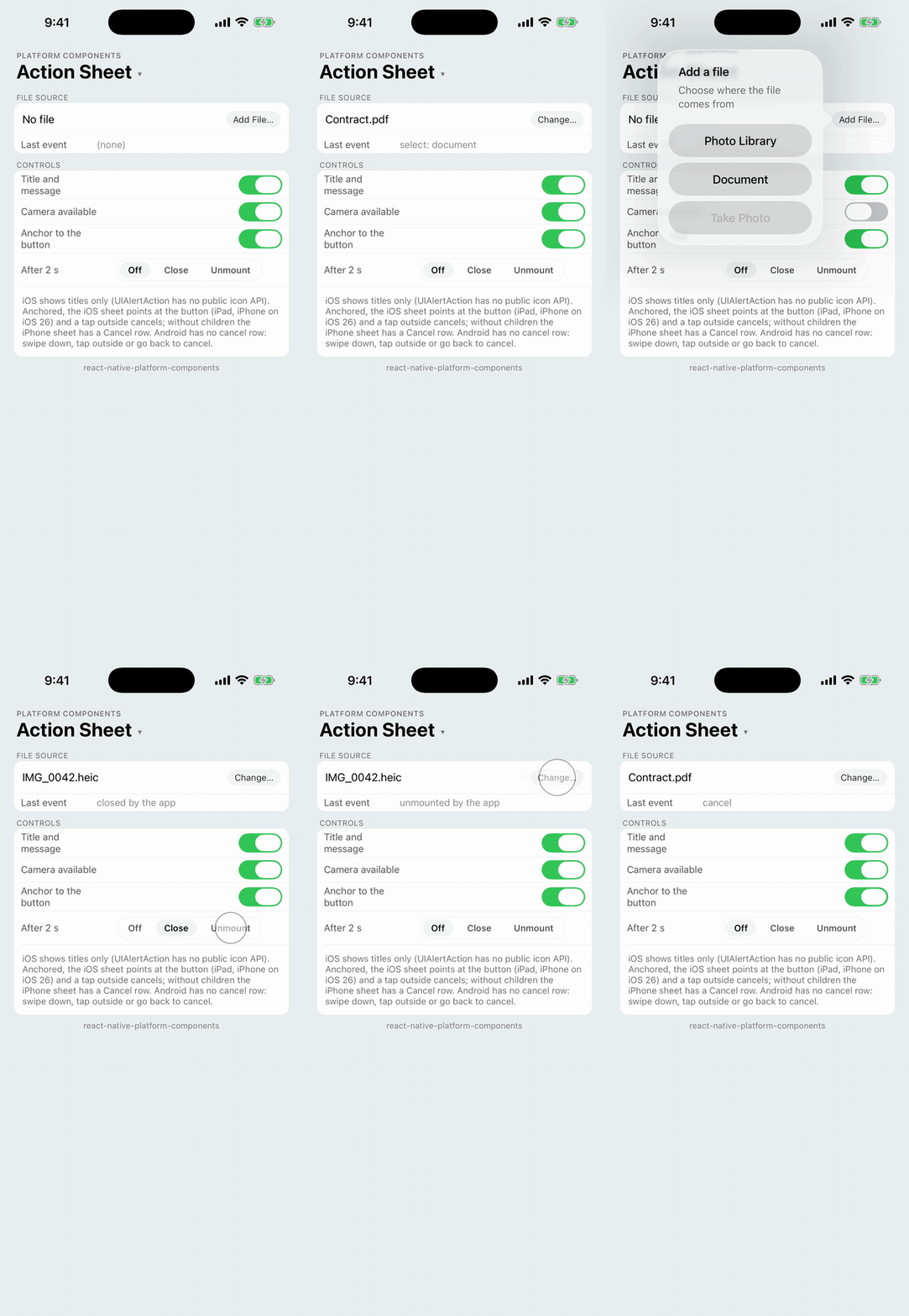 |
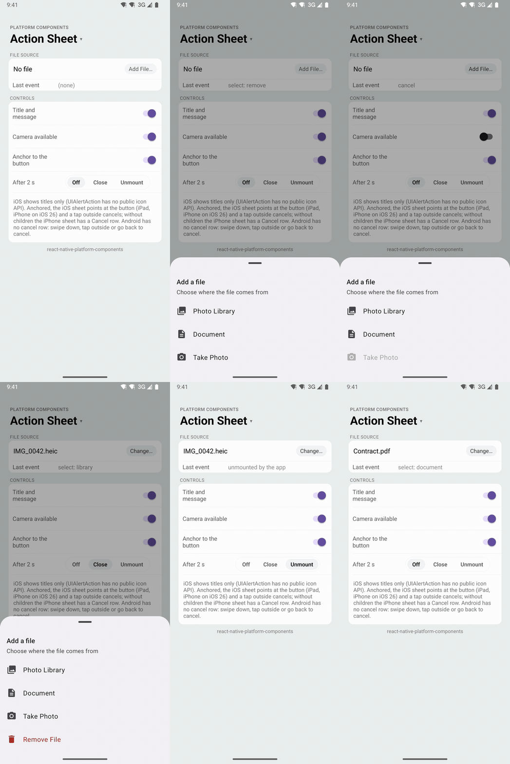 |
A short list of actions presented from the bottom of the screen, or as a popover pointing at its trigger. Use it for a choice the user makes on the spot, such as where a file comes from.
- iOS:
UIAlertControllerwith the.actionSheetstyle, presented from the nearest view controller. On iPad, and on iPhone from iOS 26, UIKit shows it as a popover pointing at the component's children. - Android: a Material 3 modal bottom sheet (
BottomSheetDialog) with a drag handle, the title and message, and a row per action, in the app's Material theme. - Web: a
<dialog>with a button per action and a cancel button.
| iOS 26 (iPhone) | iPad | Android |
|---|---|---|
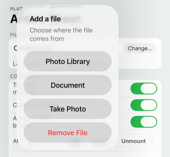 | 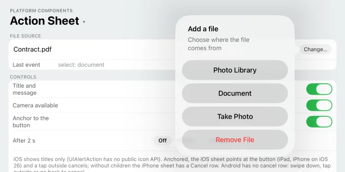 | 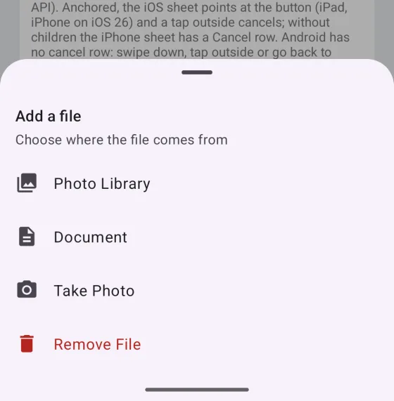 |
import { ActionSheet } from 'react-native-platform-components';

const [open, setOpen] = useState(false);

<ActionSheet
  visible={open}
  title="Add a file"
  message="Choose where the file comes from"
  actions={[
    {
      id: 'library',
      title: 'Photo Library',
      image: { ios: 'photo', android: 'photo_library' },
      testID: 'source-library',
    },
    {
      id: 'document',
      title: 'Document',
      image: { ios: 'doc', android: 'description' },
      testID: 'source-document',
    },
    {
      id: 'camera',
      title: 'Take Photo',
      image: { ios: 'camera', android: 'photo_camera' },
      testID: 'source-camera',
    },
    {
      id: 'remove',
      title: 'Remove File',
      attributes: { destructive: true },
      testID: 'source-remove',
    },
  ]}
  cancelTestID="source-cancel"
  haptics="selection"
  onSelect={(id) => {
    setOpen(false);
    pickSource(id);
  }}
  onCancel={() => setOpen(false)}
>
  <Button label="Add File…" onPress={() => setOpen(true)} />
</ActionSheet>;
The sheet is controlled: visible presents it, and the app sets it back to false in onSelect and onCancel. Setting visible to false while the sheet is up dismisses it without a callback, and unmounting the component dismisses it too.
Props
| Prop | Type | Description |
|---|---|---|
visible | boolean | Whether the sheet is presented (required) |
title | string | Title above the actions |
message | string | Message under the title |
actions | ActionSheetAction[] | The actions, top to bottom. See ActionSheetAction |
cancelTitle | string | iOS: title of the cancel action. Default: the system's localized "Cancel". See Cancel |
cancelTestID | string | iOS: test identifier of the cancel action |
haptics | 'selection' | 'light' | 'medium' | 'heavy' | 'success' | 'warning' | 'error' | 'none' | Haptic played when the user picks an action (not on cancel); an action's own haptics wins. See Haptics. Default: none |
maxFontSizeMultiplier | number | Android: largest scale the sheet's text may reach with the system font scale, as on Text. Unset or 0: no cap. iOS sizes the sheet with Dynamic Type itself |
onSelect | (id: string) => void | Called with the action's id when the user picks one |
onCancel | () => void | Called when the sheet is dismissed without a pick |
children | ReactNode | Optional content, rendered in place. The popover points at it. See Anchor |
testID | string | Test identifier of the component's view |
ActionSheetAction
The same fields as a ContextMenu action, without submenus, sections or states:
| Property | Type | Description |
|---|---|---|
id | string | Unique, non-empty identifier passed to onSelect |
title | string | Display text |
image | string | PlatformIcon | Android: the row's leading icon. See Icons |
imageColor | string | Android: tint color for the icon (hex string) |
attributes | { destructive?, disabled?, hidden? } | destructive draws the action in red, disabled dims it so it can't be picked, hidden leaves it out |
haptics | 'selection' | ... | 'none' | Haptic played when this action is picked, in place of the component's haptics |
testID | string | Test identifier of the action: the UIAlertAction's accessibilityIdentifier on iOS, the row's view tag on Android. See Testing |
Anchor
The children render in place, like any view: usually the button that opens the sheet. Where UIKit shows the sheet as a popover, it points at them:
- iPad: always a popover. Without children it sits in the middle of the screen, without an arrow.
- iPhone, iOS 26: with children, the sheet is a popover pointing at them, as iOS 26 presents action sheets from the control that opened them. Without children UIKit shows the sheet in the middle of the screen, with its Cancel row.
- iPhone, before iOS 26: the classic sheet at the bottom of the screen, with its Cancel row.
- Android: the bottom sheet doesn't point at anything; the children only render.
Only children anchor the sheet, not the component's own frame: a childless ActionSheet placed anywhere (in a column it is full width and 0 high) shows the unanchored sheet.
| iOS 26 (iPhone, no children) | iPad (no children) |
|---|---|
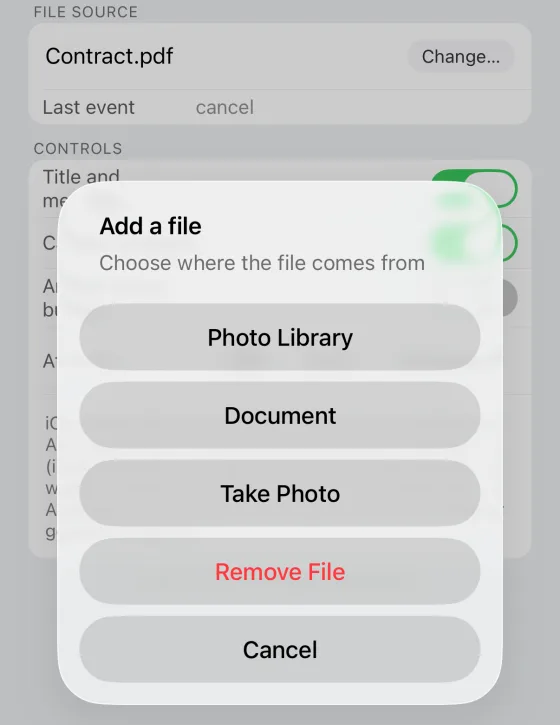 | 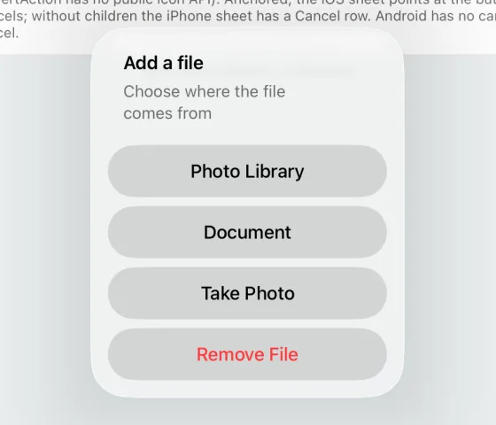 |
Cancel
Every dismissal without a pick calls onCancel:
- iOS: the sheet always has a
.cancelaction. It is a row (titledcancelTitle) when the sheet sits at the bottom of the screen; in a popover UIKit hides it and a tap outside the popover cancels instead. - Android: following Material, the bottom sheet has no cancel row. A swipe down, a tap on the scrim and the back button dismiss it and call
onCancel.cancelTitleandcancelTestIDare ignored. - Web: the cancel button, Escape and a click outside.
Destructive and disabled actions
- iOS:
destructiveusesUIAlertAction.Style.destructive(the system red);disabledsetsisEnabled = false. - Android: destructive rows draw their title and icon in the theme's
colorError(the Material 3 error red when the theme has none); an explicitimageColorstill wins for the icon. Disabled rows are dimmed to Material's 38% and ignore taps.
Disabled and hidden actions never reach onSelect.
Icons
image takes the same shapes as ContextMenu icons: a drawable name, { ios, android }, or { type: 'image', source }. On Android each row gets the icon in the 24dp leading slot of a Material list item, and when any action has an icon, every row keeps the icon column so the titles line up.
UIAlertAction has no public API for images, so iOS shows titles only and ignores image and imageColor. The library doesn't set images through private keys.
Android theme
The sheet is built from the app's Material theme (with the theme's bottomSheetDialogTheme), so it takes your colors and shapes. With an AppCompat theme it falls back to Material 3 defaults and logs one warning, like the other Material components (see Android Theme Configuration). The sheet opens fully expanded, draws edge to edge behind the navigation bar with its rows above it, and scrolls when the actions don't fit.
Testing
Each action's testID is what Detox's by.id matches: the accessibilityIdentifier of the UIAlertAction on iOS and the tag of the row's view on Android.
await element(by.id('add-file')).tap();
// iOS: the alert carries the identifier on more than one of its views
const library =
  device.getPlatform() === 'ios'
    ? element(by.id('source-library')).atIndex(0)
    : element(by.id('source-library'));
await waitFor(library).toBeVisible().withTimeout(6000);
await library.tap();
While the Android sheet is up, Espresso only sees the dialog's window; check the page after the sheet has closed. In Jest, the mock renders the actions as Pressables with their testIDs while visible.