SelectionMenu
| iOS | Android |
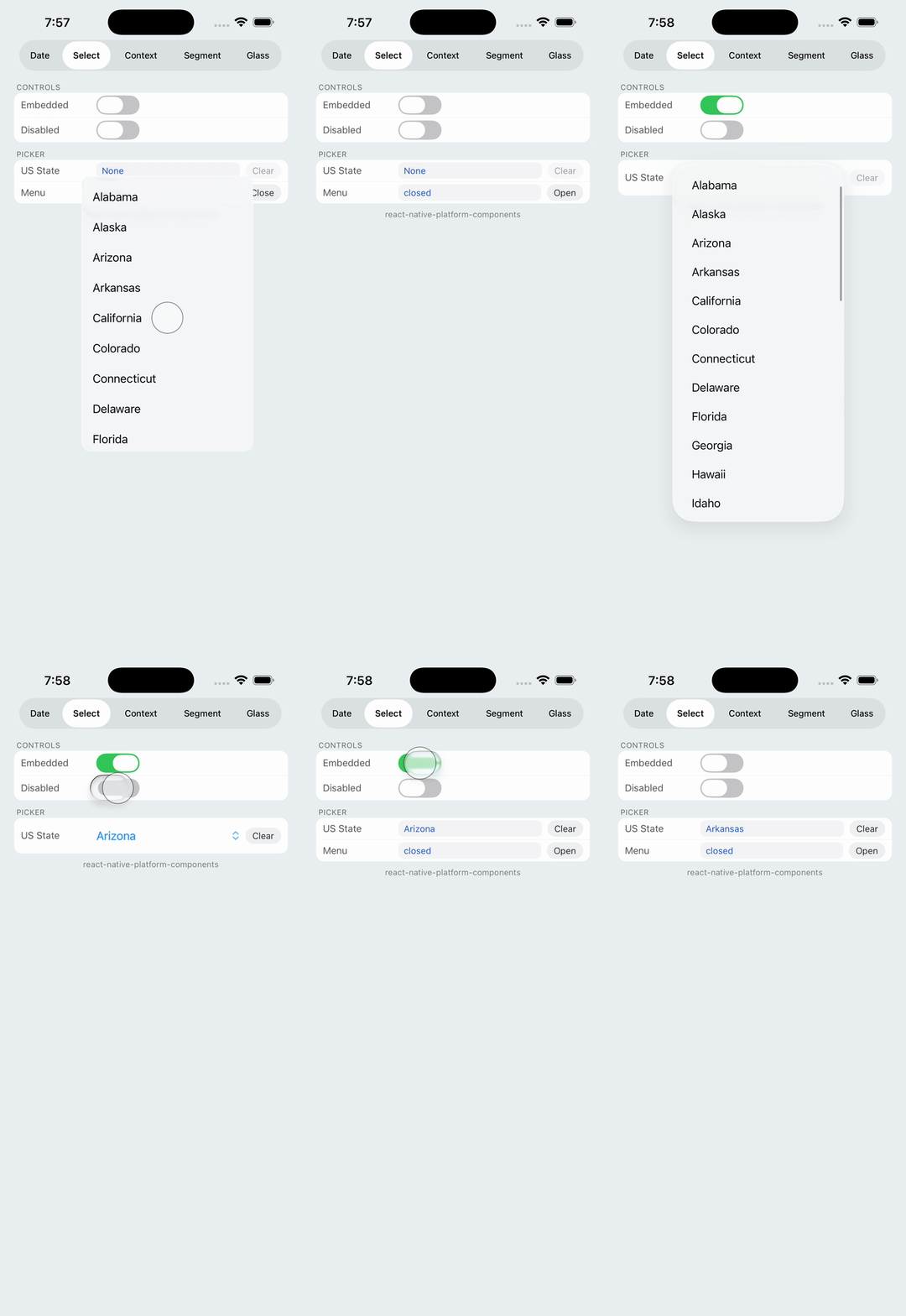 |
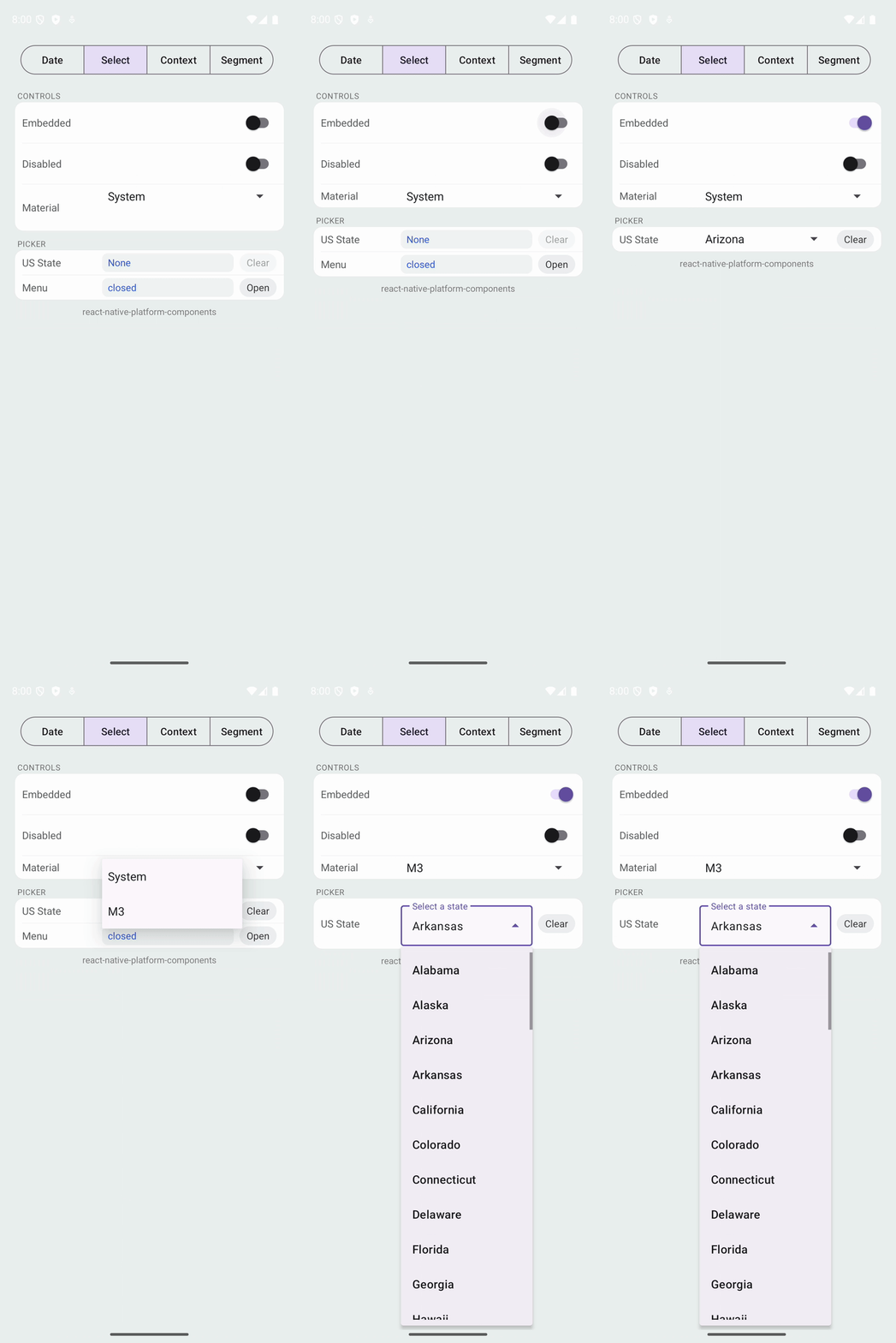 |
Native selection menu with modal and embedded modes.
Props
| Prop | Type | Description |
|---|---|---|
options | { label: string; data: string }[] | Array of options to display |
selected | string | null | Currently selected option's data value |
disabled | boolean | Disables the menu |
placeholder | string | Placeholder text when no selection |
presentation | 'modal' | 'embedded' | Presentation mode (default: 'modal') |
visible | boolean | Controls modal mode menu visibility |
onSelect | (data, label, index) => void | Called when user selects an option |
onRequestClose | () => void | Called when menu is dismissed without selection |
android.material | 'system' | 'm3' | Material Design style preference |
Modes
- Modal mode (default): Menu visibility controlled by
visibleprop. Use for custom trigger UI. - Embedded mode (
presentation="embedded"): Native picker UI rendered inline. Menu managed internally.
Note: On iOS, modal mode uses a custom popover to enable programmatic presentation. For the full native menu experience (system animations, scroll physics), use embedded mode. This is an intentional trade-off: modal gives you control over the trigger UI, embedded gives you the complete system menu behavior.