Switch
| iOS | Android |
 |
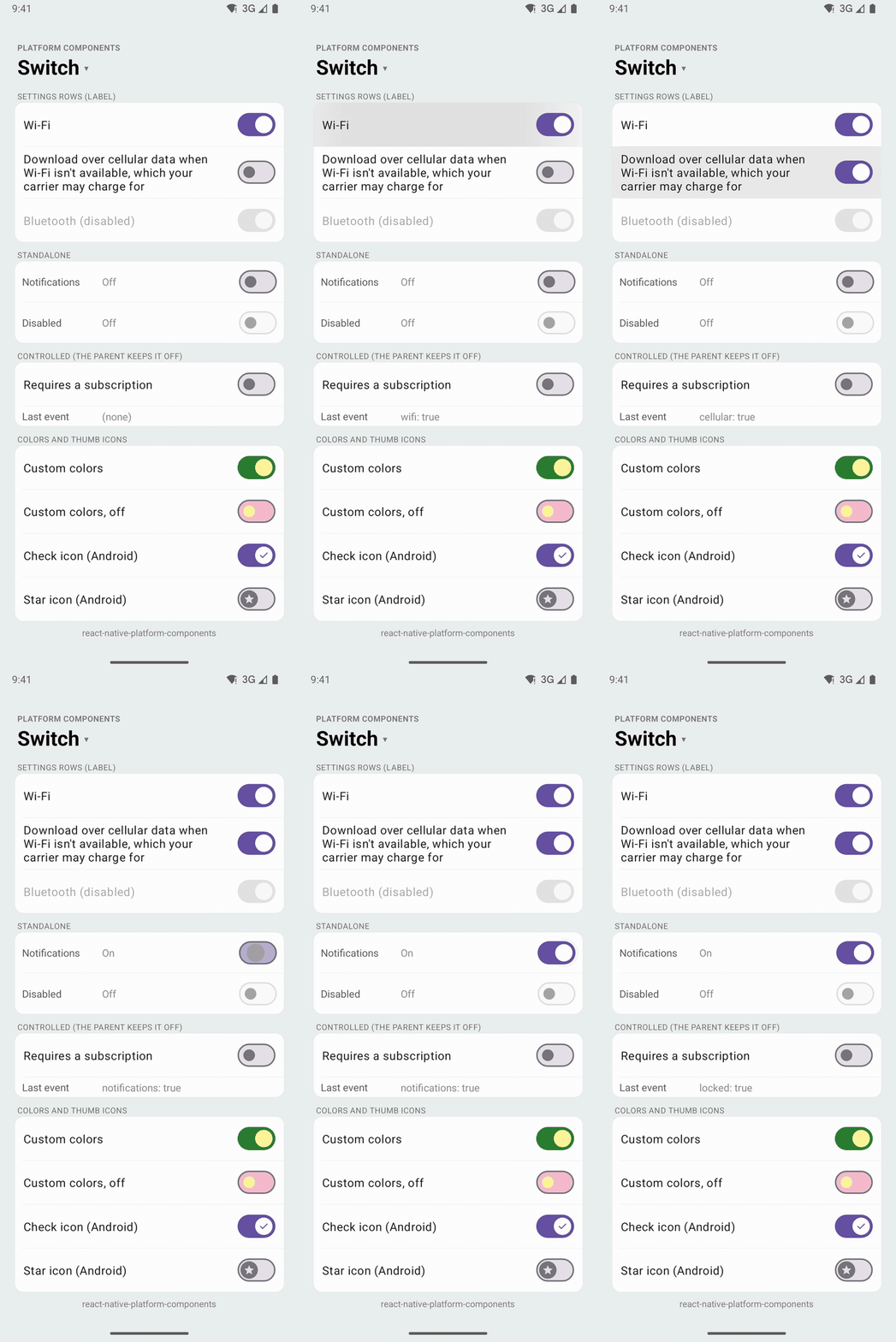 |
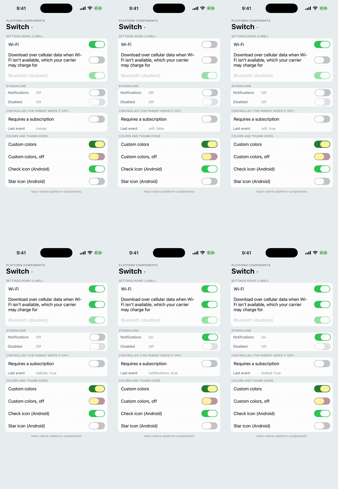
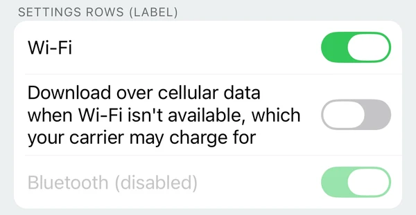
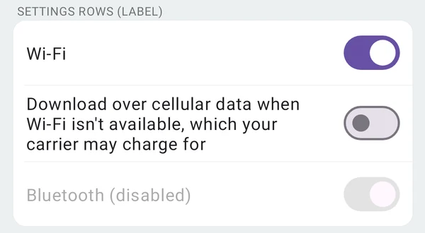
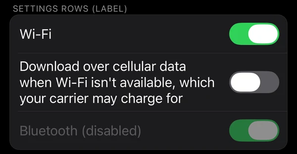
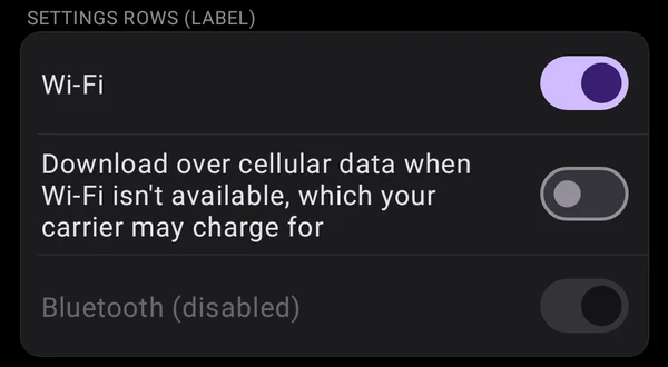
An on / off control. With a label, it is a settings row: the label at the leading edge, the switch at the trailing edge, and a tap anywhere on the row toggles it.
- Android: Material 3
MaterialSwitchin the app's Material theme: the wider track, the thumb that grows when on, Material motion and optional thumb icons. React Native's ownSwitchis still the pre-Material 3SwitchCompaton Android. - iOS:
UISwitch(Liquid Glass on iOS 26). - Web: a checkbox with the switch role (
role="switch"), drawn as a switch by Safari 17.4+.
| iOS 26 | Android |
|---|---|
 |  |
 |  |
import { Switch } from 'react-native-platform-components';

const [wifi, setWifi] = useState(true);

// A settings row: the whole row toggles
<Switch label="Wi-Fi" value={wifi} onValueChange={setWifi} />

// A switch on its own, next to your own content
<Switch
  accessibilityLabel="Notifications"
  value={notifications}
  onValueChange={setNotifications}
/>
Props
| Prop | Type | Description |
|---|---|---|
value | boolean | Whether the switch is on (controlled). See Controlled value. Default: false |
onValueChange | (value: boolean) => void | Called with the new value when the user toggles the switch |
disabled | boolean | Disables the switch (and its row) |
label | string | Makes it a settings row with this text at the leading edge. See Settings row |
color | ColorValue | Track color while on. Default: the theme's. See Colors |
trackColor | ColorValue | Track color while off. Default: the theme's |
thumbColor | ColorValue | Thumb color, on and off. Default: the theme's |
haptics | 'selection' | 'light' | 'medium' | 'heavy' | 'success' | 'warning' | 'error' | 'none' | Haptic played when the user toggles the switch. See Haptics. Default: none |
maxFontSizeMultiplier | number | Largest scale the label may reach with the system text size (Dynamic Type / font scale), as on Text. Unset or 0: no cap |
accessibilityLabel | string | Screen-reader label. Defaults to label. Give a switch without a label one |
testID | string | Test identifier of the element that has the label and the state and takes the touches: the row with a label, the switch without one |
android.thumbIcon | 'check' | PlatformIcon | Icon on the thumb. See Thumb icons |
Switch also takes the usual view props (style and so on).
Controlled value
Switch is controlled, with React Native's Switch semantics. A tap (or a drag of the thumb) moves the switch and calls onValueChange with the new value; when JavaScript has answered, the switch shows value again. So a parent that stores the new value keeps the switch where the user put it, and a parent that doesn't (a setting that needs a subscription, a request that failed) sends it back:
// Follows the user
<Switch label="Wi-Fi" value={wifi} onValueChange={setWifi} />

// Always goes back off
<Switch
  label="Sync over cellular"
  value={false}
  onValueChange={() => showUpgradePrompt()}
/>
A parent that sets value later, after an async call, sees the switch go back first and then move to the new value.
Settings row
With label, the component is a row: the label at the leading edge in the platform's body text (UIKit's body style on iOS, Material's textAppearanceBodyLarge on Android), the switch at the trailing edge, both centered vertically. Right to left, the two swap sides.
- The whole row toggles the switch: a tap on the label, on the space between, or on the row's padding. A tap or drag on the switch itself goes to the switch, as usual.
- The label wraps onto more lines when the row is narrow (or the text is large), and the row grows to fit it. It follows the system text size, up to
maxFontSizeMultiplier. - The row has no padding or height of its own: give it the spacing your list uses through
style. Padding is part of the row, so a tap there toggles it too. - On Android the row has Material's ripple (
selectableItemBackground), as Material list items do. iOS rows don't highlight, as in UIKit. - Disabled, the label dims with the switch: UIKit's disabled label color on iOS, Material's 38% content opacity on Android.
<Switch
  style={{ paddingHorizontal: 16, paddingVertical: 8, minHeight: 48 }}
  label="Download over cellular data when Wi-Fi isn't available"
  value={cellular}
  onValueChange={setCellular}
/>
Without a label the component is the size of the switch. If a layout makes it wider (a column's default alignItems: 'stretch'), the switch sits at the leading edge and only the switch takes taps.
Accessibility
The switch (or its row) is one element with the switch role, its on / off state and its label, so VoiceOver and TalkBack read it once: "Wi-Fi, switch, on".
- iOS: with a
label, the row is the accessibility element, withUISwitch's traits and value ("1" or "0", read as on / off), and VoiceOver's double tap toggles it. Without one, theUISwitchitself is the element. - Android: the component's view is the element, with the
android.widget.Switchclass, checkable and checked state, andcontentDescriptionfor the label. TheMaterialSwitchinside it is hidden from TalkBack.
Colors
Leave the colors unset to follow the theme:
- Android: the Material theme's colors (
colorPrimaryfor the track while on,colorOnPrimaryfor the thumb,colorOutlineandcolorSurfaceContainerHighestwhile off), including your brand color fromuseNativeTheme. - iOS: UIKit's green while on, or the brand color from
useNativeThemewhen one is set (the way SwiftUI'sTogglefollows the tint).
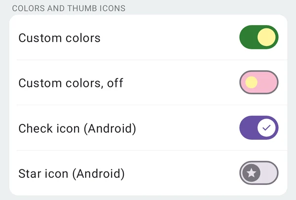
color replaces the on track color, trackColor the off track color, and thumbColor the thumb in both states. Disabled switches keep the theme's disabled colors.
| iOS 26 | Android |
|---|---|
 |  |
- iOS:
colorisonTintColorandthumbColoristhumbTintColor. UIKit has no off track color:trackColorgoes behind the switch, where it shows through UIKit's translucent off track (as with React Native'sSwitch), so it looks lighter than the color you pass. - Android: the
MaterialSwitch'strackTintList(on and off) andthumbTintList. Material's outline around the off track stays.
Thumb icons (Android)
android.thumbIcon puts an icon on the Material 3 thumb (thumbIconDrawable), tinted by the theme:
'check': Material's check mark while the switch is on. While off, the thumb keeps its plain, smaller size.- Any other icon (a drawable name,
{ type: 'drawable', name }or{ type: 'image', source }): shown on and off, and the thumb takes its larger size in both states. To use a drawable namedcheck, pass{ type: 'drawable', name: 'check' }.
<Switch
  label="Dark theme"
  value={dark}
  onValueChange={setDark}
  android={{ thumbIcon: 'check' }}
/>
iOS has no thumb icons and ignores the option.
Testing
The element with the testID is the one with the label and the state, and the one that takes the touches, so by.id finds, reads and taps one element:
await expect(element(by.id('settings-wifi'))).toHaveLabel('Wi-Fi');
await element(by.id('settings-wifi')).tap();
To read the state:
- Android: the element is
Checkable, sotoHaveToggleValue(true)works. - iOS: Detox's
toHaveToggleValueneeds aUISwitch, which a row isn't; read its accessibility value instead,"1"for on and"0"for off (a switch without a label is aUISwitch, which reports the same).
const expectSwitch = (id: string, on: boolean) =>
  device.getPlatform() === 'android'
    ? expect(element(by.id(id))).toHaveToggleValue(on)
    : expect(element(by.id(id))).toHaveValue(on ? '1' : '0');
In Jest, the mock renders a Pressable with the switch role, testID, accessibilityState.checked and the label as Text. Pressing it calls onValueChange with the other value, and fireEvent(element, 'valueChange', true) works as with React Native's Switch.
Android theme
The switch is built from the app's Material theme, so it takes your colors, and it follows useNativeTheme and light / dark changes. With an AppCompat theme it falls back to Material 3 defaults and logs one warning, like the other Material components (see Android Theme Configuration).
Web
A checkbox with role="switch" (and Safari's switch attribute, which draws a native switch in Safari 17.4+), tinted with color or the brand color through accent-color. With a label it is a <label> row, so a click anywhere on it toggles the box. The input carries the testID as data-testid. trackColor, thumbColor, haptics, maxFontSizeMultiplier and android are ignored.