Button
| iOS | Android |
 |
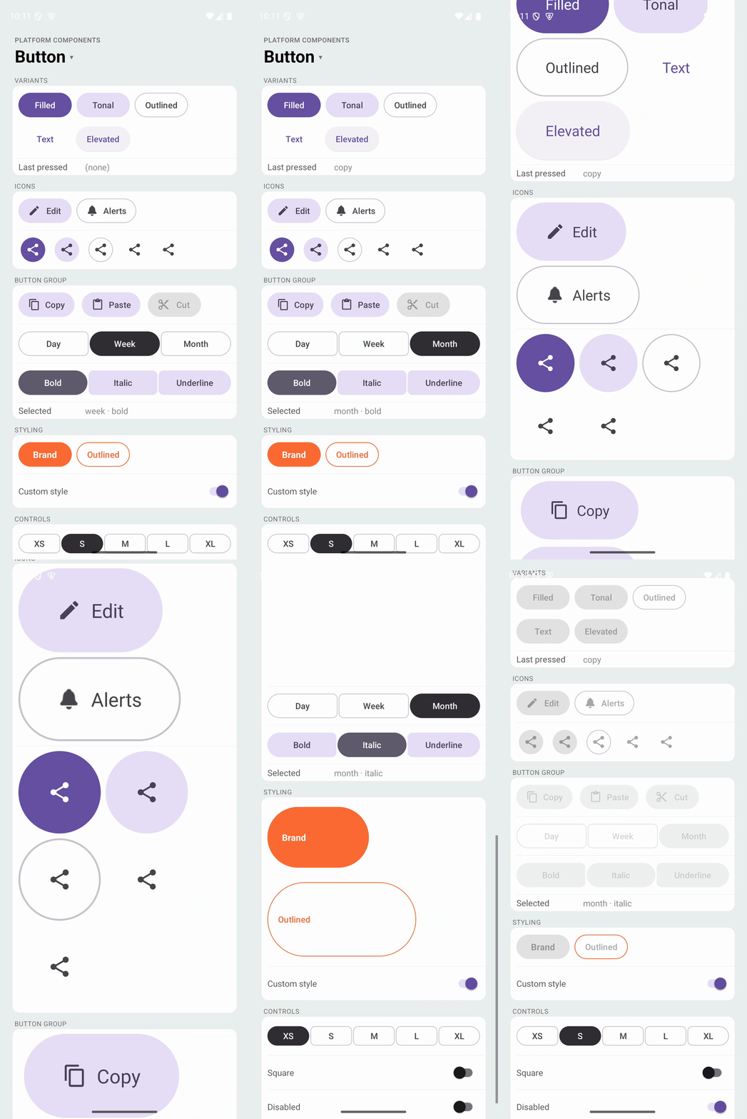 |
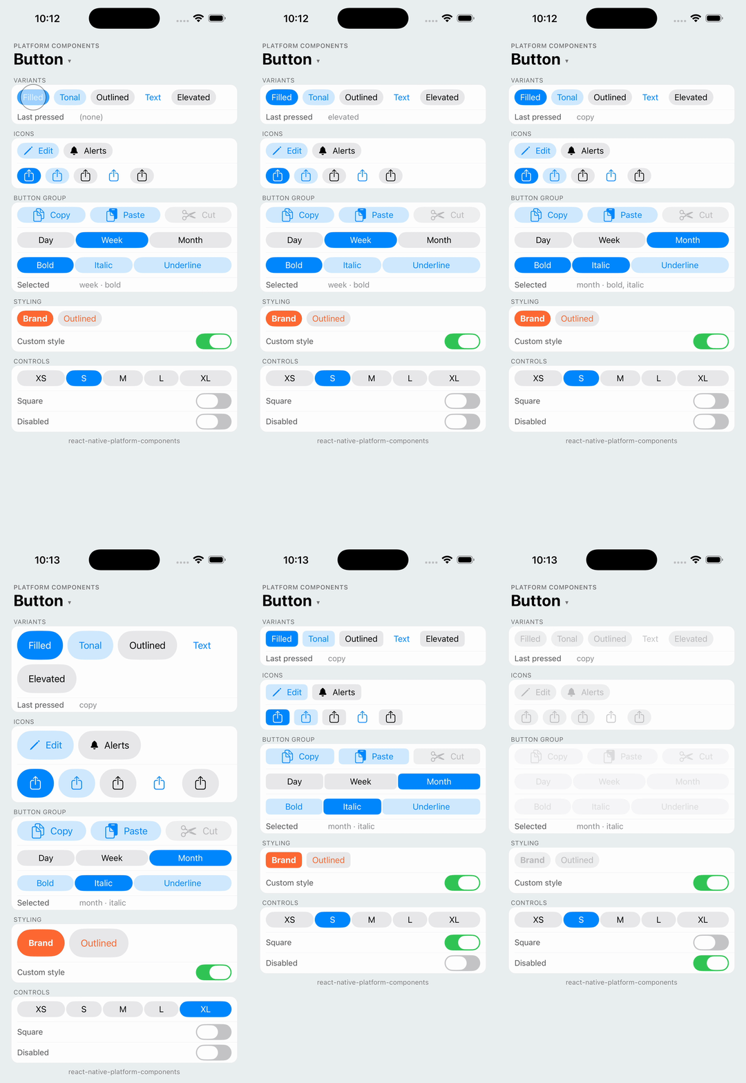
Native button using MaterialButton with the Material 3 Expressive styles on Android and UIButton with a UIButton.Configuration on iOS. Each platform draws its own button: Android gets the Expressive shapes, sizes and press morph, iOS gets the system button of the iOS version it runs on.
import { Button } from 'react-native-platform-components';

<Button label="Save" onPress={save} />
<Button label="Cancel" variant="text" onPress={cancel} />
<Button icon="plus" variant="tonal" accessibilityLabel="Add" onPress={add} />
Props
| Prop | Type | Description |
|---|---|---|
label | string | Button text. Omit for an icon-only button |
icon | PlatformIcon | Icon before the label, or alone. See Icons |
variant | 'filled' | 'tonal' | 'outlined' | 'text' | 'elevated' | Emphasis. See Variants. Default: 'filled' |
size | 'xsmall' | 'small' | 'medium' | 'large' | 'xlarge' | Size. See Sizes. Default: 'small' |
shape | 'round' | 'square' | Corner shape. See Shape. Default: platform default |
disabled | boolean | Disables the button |
color | ColorValue | Container (background) color |
tintColor | ColorValue | Label and icon color |
labelStyle | { fontFamily?, fontSize?, fontWeight?, fontStyle? } | Label font. See Styling |
accessibilityLabel | string | Screen-reader label. Defaults to label; give icon-only buttons one |
onPress | () => void | Called when the button is pressed |
Android Props (android)
| Prop | Type | Description |
|---|---|---|
rippleColor | ColorValue | Ripple shown while pressing |
strokeColor | ColorValue | Outline color (outlined variant) |
material | 'm3' | 'expressive' | Material style: Material 3 Expressive (default) or the classic Material 3 button. See Material style |
Variants
Five levels of emphasis, from highest to lowest. Android uses the Material 3 Expressive button styles; iOS uses the closest UIButton.Configuration, so buttons look like every other button on that iOS version.
| Variant | Android | iOS |
|---|---|---|
filled | Filled button (materialButtonStyle) | .filled() |
tonal | Filled tonal button (materialButtonTonalStyle) | .tinted() |
outlined | Outlined button (materialButtonOutlinedStyle) | .bordered() |
text | Text button (borderlessButtonStyle) | .plain() |
elevated | Elevated button (materialButtonElevatedStyle) | .gray() |
Sizes
Material 3 Expressive defines five button sizes; iOS maps them onto UIButton.Configuration.Size.
| Size | Android height | iOS |
|---|---|---|
xsmall | 32dp | .mini |
small | 40dp (default) | .small |
medium | 56dp | .medium |
large | 96dp | .large |
xlarge | 136dp | .large |
The button wraps its content. Give it alignSelf: 'stretch' or a width style to make it fill.
Shape
Material 3 Expressive buttons come in two shapes: round (a pill, the default) and square (rounded corners). On Android the shape morphs when pressed, the signature Expressive interaction, and selected buttons in a ButtonGroup morph too. On iOS round sets the capsule corner style and square the large one; unset keeps UIKit's dynamic corners.
<Button label="Round" shape="round" size="medium" />
<Button label="Square" shape="square" size="medium" />
Icons
icon accepts the same shapes as SegmentedControl: an SF Symbol or drawable name, an image asset, or an { ios, android } pair.
// Native symbol on each platform
<Button
  label="Share"
  icon={{
    ios: { type: 'sfSymbol', name: 'square.and.arrow.up' },
    android: { type: 'drawable', name: 'share' },
  }}
/>

// One image asset for both, drawn as a tinted template
<Button label="Alerts" icon={{ type: 'image', source: require('./bell.png') }} />
A button with an icon and no label is an icon button: on Android it uses the Material 3 Expressive icon button styles (a square container that keeps the variant), on iOS an image-only UIButton. Always give it an accessibilityLabel.
Styling
Colors take any React Native ColorValue. Fonts follow the Text style conventions.
<Button
  label="Brand"
  color="#FF6B35"
  tintColor="white"
  labelStyle={{ fontWeight: '700', fontSize: 15 }}
  android={{ rippleColor: 'rgba(255, 255, 255, 0.3)' }}
/>
| Prop | Android | iOS |
|---|---|---|
color | backgroundTint | baseBackgroundColor |
tintColor | Text color and iconTint | baseForegroundColor |
labelStyle | Typeface and size | Title font |
android.rippleColor | Press ripple | — |
android.strokeColor | Outline (outlined variant) | — |
Without these props the button takes its colors from the theme: the app's Material 3 theme or the brand color set with useNativeTheme on Android, the tint color on iOS.
Inside a FloatingToolbar
Buttons placed in a FloatingToolbar pick up the toolbar's button styles on Android, as Material's own toolbar children do: filled and text buttons become the toolbar's flat buttons, icon-only text buttons become the toolbar's icon buttons, and tonal keeps its container for an emphasized action.
Material style
android.material picks the Android design generation: 'expressive' (default) gives the Material 3 Expressive styles with their five sizes, two shapes and press morph; 'm3' gives the classic Material 3 button, which has one size and shape, so size and shape are ignored. Use 'm3' on screens that keep the older Material 3 look. Buttons inside a FloatingToolbar always take the toolbar's Expressive styles. SegmentedControl and ButtonGroup take the same prop.
Android theme
The Expressive look is a set of widget styles applied over your app theme, so your colors (and useNativeTheme) are kept. It works with a Theme.Material3 app theme and with the library's Material 3 fallback; see Android Theme Configuration.