ButtonGroup
| iOS | Android |
 |
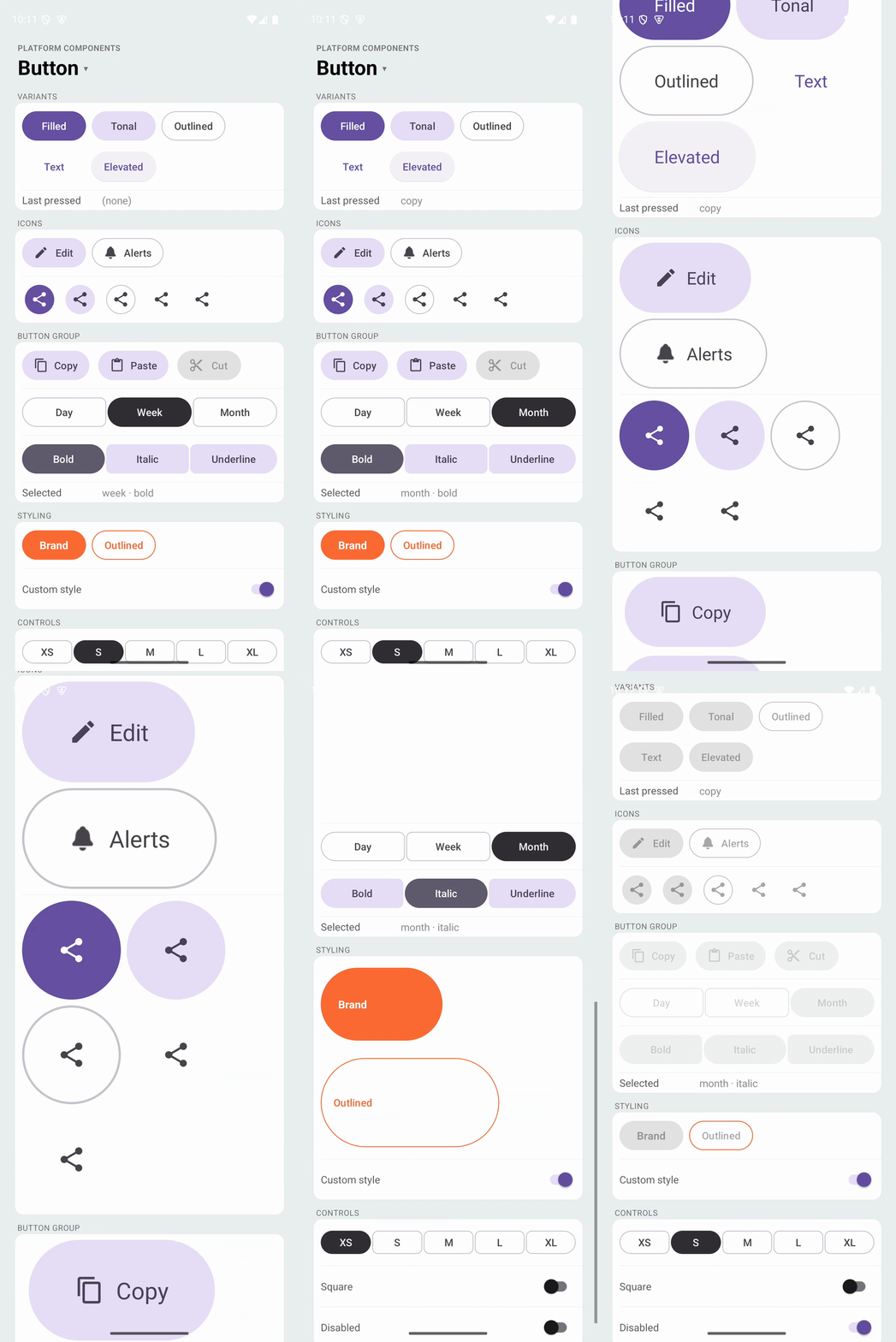 |
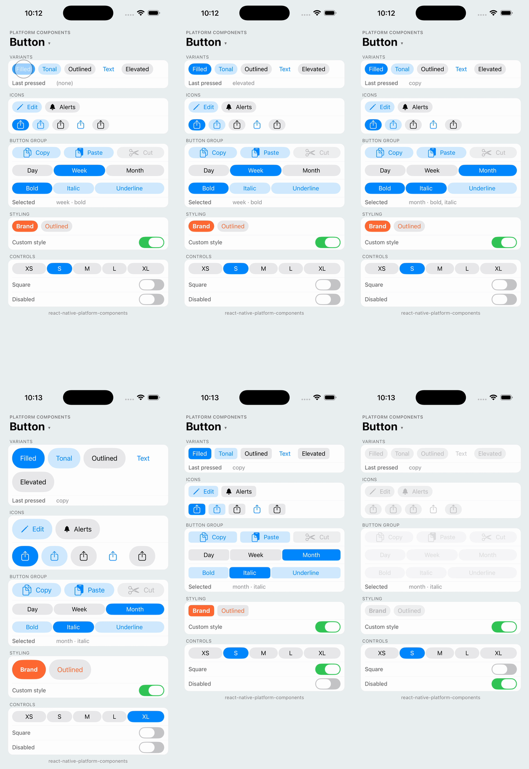
A row of related buttons using MaterialButtonGroup and MaterialButtonToggleGroup (Material 3 Expressive) on Android and a row of UIButtons on iOS. Use it for a set of actions, or for single / multiple selection.
import { ButtonGroup } from 'react-native-platform-components';

// Actions
<ButtonGroup
  buttons={[
    { label: 'Copy', value: 'copy' },
    { label: 'Paste', value: 'paste' },
  ]}
  onPress={(value) => run(value)}
/>

// Single selection
<ButtonGroup
  buttons={[
    { label: 'Day', value: 'day' },
    { label: 'Week', value: 'week' },
    { label: 'Month', value: 'month' },
  ]}
  selection="single"
  selectedValues={[range]}
  onSelectionChange={([value]) => value && setRange(value)}
/>
Props
| Prop | Type | Description |
|---|---|---|
buttons | ButtonGroupButton[] | Buttons to display |
variant | 'filled' | 'tonal' | 'outlined' | 'text' | 'elevated' | Emphasis of every button. See Button variants. Default: 'outlined' |
size | 'xsmall' | 'small' | 'medium' | 'large' | 'xlarge' | Size of every button. Default: 'small' |
shape | 'round' | 'square' | Corner shape of every button. Default: platform default |
connected | boolean | Connected group. See Standard and connected. Default: true when selecting |
spacing | number | Gap between buttons in points. Default: the platform's group spacing |
selection | 'none' | 'single' | 'multiple' | Selection behavior. See Selection. Default: 'none' |
selectedValues | string[] | Values of the selected buttons (controlled) |
selectionRequired | boolean | Whether one button must stay selected. Default: true for single, false for multiple |
disabled | boolean | Disables the entire group |
color | ColorValue | Container (background) color of the buttons |
tintColor | ColorValue | Label and icon color of the buttons |
labelStyle | { fontFamily?, fontSize?, fontWeight?, fontStyle? } | Label font |
onPress | (value: string, index: number) => void | Called when a button is pressed, in every selection mode |
onSelectionChange | (values: string[]) => void | Called when the selection changes, with the selected values in button order |
ButtonGroupButton
| Property | Type | Description |
|---|---|---|
label | string | Button text. Omit for an icon-only button |
value | string | Unique value returned in callbacks |
disabled | boolean | Disables this specific button |
icon | PlatformIcon | Optional icon. See Button icons |
accessibilityLabel | string | Screen-reader label. Defaults to label; give icon-only buttons one |
Android Props (android)
| Prop | Type | Description |
|---|---|---|
overflow | 'none' | 'menu' | 'wrap' | Buttons that don't fit are clipped (default), moved into an overflow menu (MaterialButtonGroup overflow), or wrapped onto more rows |
rippleColor | ColorValue | Ripple shown while pressing a button |
strokeColor | ColorValue | Outline color (outlined variant) |
material | 'm3' | 'expressive' | Material style: Material 3 Expressive (default) or the classic Material 3 group, which has one size and shape. See Button |
Standard and connected
Material 3 Expressive has two kinds of button group:
- Standard (
connected: false, the default for actions): each button keeps its own shape and the group has a wider gap. On Android the pressed button widens and its neighbors shrink, the Expressive size morph. - Connected (
connected: true, the default when selecting): the buttons share one outline with a hairline gap and small inner corners; the selected button rounds into a pill. This is the successor of Material's segmented buttons. Buttons size to their content; connected buttons also share any extra width equally when you stretch the group (alignSelf: 'stretch').
On iOS both kinds are a row of content-sized UIButtons: a 2pt gap for a connected group, 8pt for a standard one.
Selection
selection | Behavior |
|---|---|
'none' | Plain actions; only onPress fires |
'single' | One button selected at a time. Tapping the selected button clears it unless selectionRequired (the default for single) |
'multiple' | Any number of buttons selected. With selectionRequired, the last selected button can't be cleared |
Selection is controlled: pass selectedValues and update it from onSelectionChange. Android uses MaterialButtonToggleGroup, so the selected buttons take the variant's selected colors and the Expressive checked shape. On iOS selected buttons switch to the filled configuration, as UIKit's own toggle buttons do.
const [format, setFormat] = useState<string[]>(['bold']);

<ButtonGroup
  buttons={[
    { label: 'Bold', value: 'bold' },
    { label: 'Italic', value: 'italic' },
    { label: 'Underline', value: 'underline' },
  ]}
  variant="tonal"
  selection="multiple"
  selectedValues={format}
  onSelectionChange={setFormat}
/>
Styling
color, tintColor, labelStyle and the Android colors apply to every button; see Button styling. Without them the buttons take their colors from the theme, including the brand color set with useNativeTheme on Android.