DatePicker
| iOS | Android |
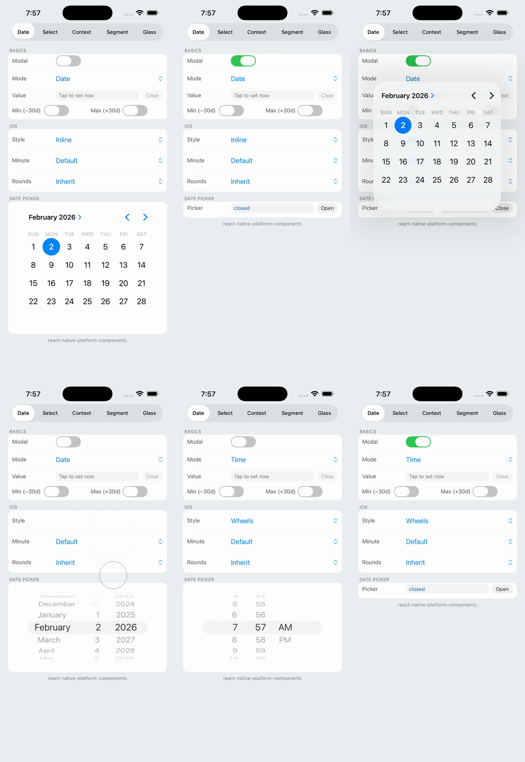 |
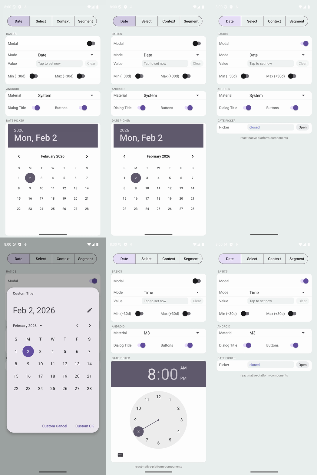 |
Native date & time picker using platform system pickers.
Props
| Prop | Type | Description |
|---|---|---|
date | Date | null | Controlled date value |
minDate | Date | null | Minimum selectable date |
maxDate | Date | null | Maximum selectable date |
locale | string | Locale identifier (e.g., 'en-US') |
timeZoneName | string | Time zone identifier |
mode | 'date' | 'time' | 'dateAndTime' | 'countDownTimer' | Picker mode |
presentation | 'modal' | 'embedded' | Presentation style |
visible | boolean | Controls modal visibility (modal mode only) |
onConfirm | (date: Date, confirmed: boolean) => void | Called on date change; confirmed is true for deliberate selections (see below) |
onClosed | () => void | Called when modal is dismissed |
iOS Props (ios)
| Prop | Type | Description |
|---|---|---|
preferredStyle | 'automatic' | 'compact' | 'inline' | 'wheels' | iOS date picker style |
countDownDurationSeconds | number | Duration for countdown timer mode |
minuteInterval | number | Minute interval (1-30) |
roundsToMinuteInterval | 'inherit' | 'round' | 'noRound' | Rounding behavior |
showConfirmToolbar | boolean | Modal only. Show Cancel/Done toolbar below the picker. Defaults to true. See below. |
Android Props (android)
| Prop | Type | Description |
|---|---|---|
firstDayOfWeek | number | First day of week (1-7, Sunday=1) |
material | 'system' | 'm3' | Material Design style (modal only; embedded always uses system picker) |
dialogTitle | string | Custom dialog title |
positiveButtonTitle | string | Custom confirm button text |
negativeButtonTitle | string | Custom cancel button text |
The confirmed Flag
onConfirm fires on every date/time change, but the second argument (confirmed) lets you distinguish between browsing and deliberate selections:
| Platform / Mode | Every change | Deliberate selection |
|---|---|---|
| iOS modal | confirmed: false (user still adjusting) | confirmed: true (tapping Done) |
| iOS embedded | confirmed: true | — |
| Android modal | — | confirmed: true (pressing OK) |
| Android embedded | confirmed: true | — |
On iOS in modal presentation, the picker is shown in a popover with a Cancel/Done toolbar below it. Tapping Done emits confirmed: true; tapping Cancel or outside the popover calls onClosed. Set ios.showConfirmToolbar: false to hide the toolbar — in that mode confirmed: true never fires, and your app is expected to drive dismissal by flipping visible off (reading the current date from the stream of confirmed: false events). This only makes UX sense paired with ios.preferredStyle: 'inline'.
A common pattern is to close the modal only on a confirmed selection:
<DatePicker
  date={date}
  visible={visible}
  presentation="modal"
  mode="time"
  onConfirm={(d, confirmed) => {
    setDate(d);
    if (confirmed) setVisible(false);
  }}
  onClosed={() => setVisible(false)}
/>