NavigationRail
| iOS | Android |
 |
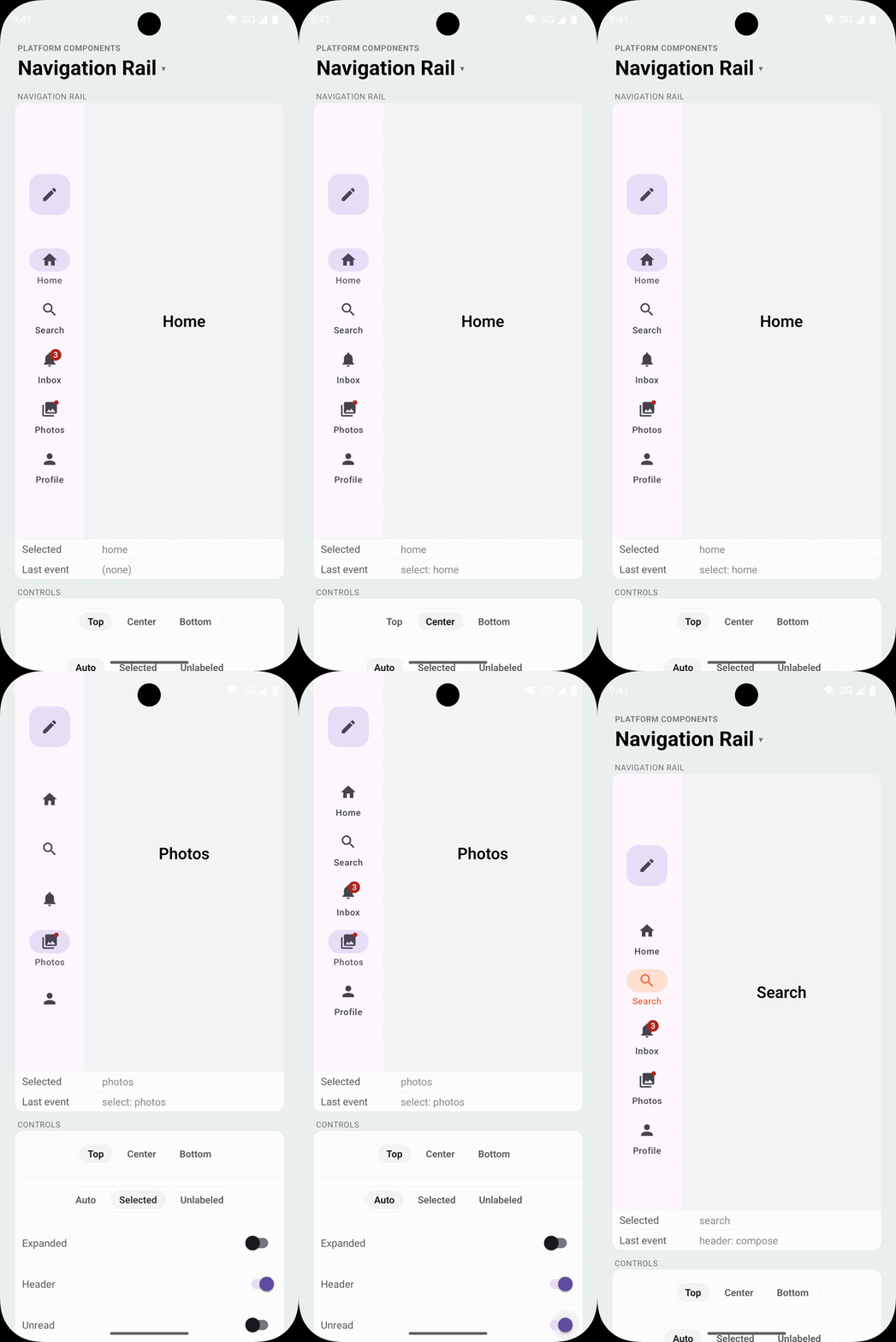 |
The Material navigation rail: the side navigation for tablets, foldables and landscape screens, where Material apps put their destinations instead of a bottom bar. Android renders NavigationRailView with the Material 3 Expressive style: destinations with the active indicator, badges, a header slot (usually a floating action button), menuGravity and the expanded rail.
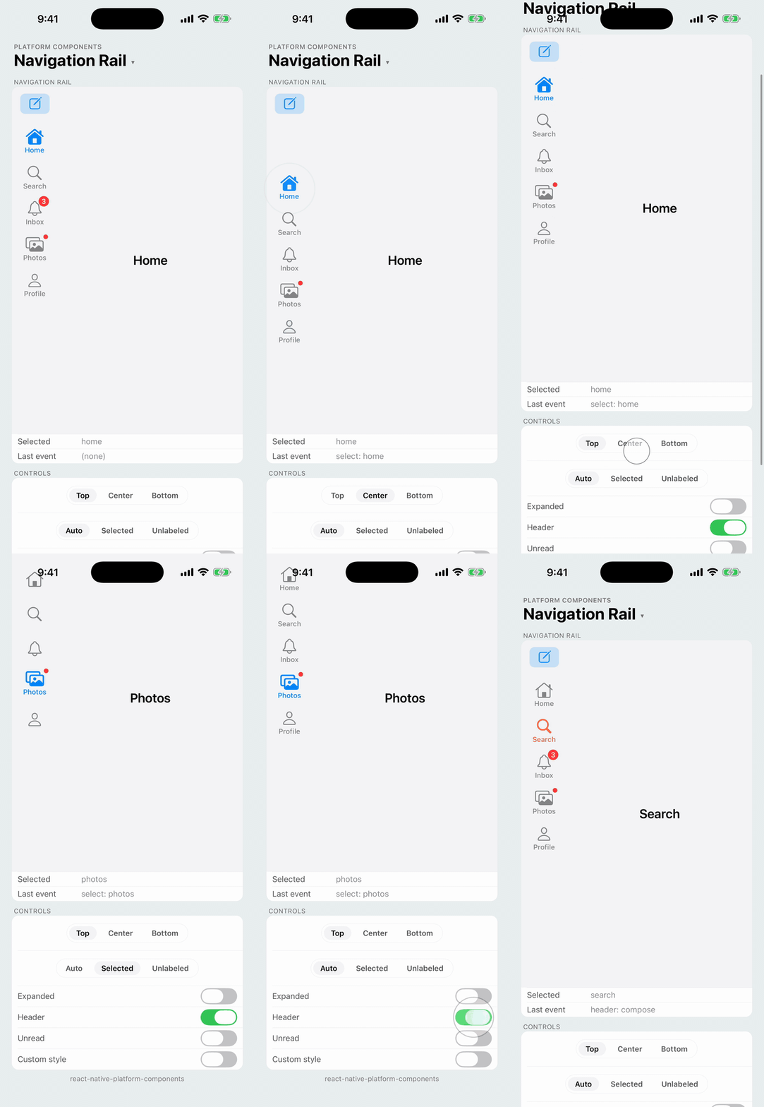
iOS has no navigation rail. The iPad sidebar belongs to the navigation stack (UISplitViewController, UITabBarController's sidebar), which this library doesn't manage. On iOS, NavigationRail falls back to a column of tab-style UIButtons: the image above the title, the selected destination in the accent color as UITabBar shows it, badges, and the header above them. It has no Material pill indicator. On iPhone, use TabBar.
| Android | iOS (iPad) |
|---|---|
 |  |
NavigationRail draws the rail and reports presses; it doesn't manage screens. Put it at the start of a row and render the selected screen beside it:
import { Button, NavigationRail } from 'react-native-platform-components';

const [destination, setDestination] = useState('home');

<View style={{ flex: 1, flexDirection: 'row' }}>
  <NavigationRail
    items={[
      { label: 'Home', value: 'home', icon: { ios: 'house', android: 'home' }, selectedIcon: { ios: 'house.fill' } },
      { label: 'Search', value: 'search', icon: { ios: 'magnifyingglass', android: 'search' } },
      { label: 'Inbox', value: 'inbox', icon: { ios: 'bell', android: 'notifications' }, badge: unread || undefined },
    ]}
    selectedValue={destination}
    onSelect={setDestination}
    header={<Button icon={{ ios: 'square.and.pencil', android: 'edit' }} accessibilityLabel="Compose" variant="tonal" size="medium" shape="square" onPress={compose} />}
  />
  <Screen name={destination} style={{ flex: 1 }} />
</View>
Props
| Prop | Type | Description |
|---|---|---|
items | NavigationRailItem[] | The destinations: the same items as TabBar tabs, role: 'search' included (systemItem is TabBar only). See TabBarItem |
selectedValue | string | null | The selected destination's value; null for none |
haptics | 'selection' | 'light' | 'medium' | 'heavy' | 'success' | 'warning' | 'error' | 'none' | Haptic played when the user presses a destination, a reselect included. See Haptics. Default: none |
onSelect | (value: string, index: number) => void | A destination was pressed |
onReselect | (value: string, index: number) => void | The selected destination was pressed again |
header | ReactNode | Shown above the destinations, usually a floating action button or a Button. See Header |
menuGravity | 'top' | 'center' | 'bottom' | Where the destinations sit. See Menu gravity. Default: 'top' |
expanded | boolean | The expanded rail, labels beside the icons. Changing it animates. See Expanded |
labelVisibility | 'auto' | 'labeled' | 'selected' | 'unlabeled' | 'auto' and 'labeled' label every destination, 'selected' the selected one. Default: 'auto' |
activeTintColor | ColorValue | Icon and label color of the selected destination |
inactiveTintColor | ColorValue | Icon and label color of the other destinations |
railColor | ColorValue | Rail background. Default: the Material surface on Android, none on iOS |
badgeStyle | { backgroundColor?, color? } | Badge colors |
labelStyle | { fontFamily?, fontSize?, fontWeight?, fontStyle? } | Label font |
maxFontSizeMultiplier | number | Cap on the label font scale, as on Text |
testID | string | Test identifier of the rail |
Android Props (android)
| Prop | Type | Description |
|---|---|---|
indicatorColor | ColorValue | The active indicator behind the selected icon |
rippleColor | ColorValue | Ripple shown while pressing a destination |
Selection
The rail is controlled, like TabBar: it shows the destination whose value is selectedValue, a press calls onSelect, and the selection only moves when selectedValue does. Pressing the selected destination calls onReselect.
Header
header takes any React content: a floating action button, a Button, your own view. On Android it goes into the rail's header slot (NavigationRailView.addHeaderView), centered above the destinations with Material's spacing. On iOS it sits above the buttons, centered, and at the leading edge when expanded. The header keeps its own size, and its touchables work as usual.
Material pairs the collapsed rail with a floating action button and the expanded rail with an extended one; switch the header's content on expanded to do the same.
Menu gravity
menuGravity places the destinations in the rail's height, as Material does: 'top' below the header, 'center' in the middle of the rail, 'bottom' at the bottom. The destinations never move above the header, so with a header and many destinations 'center' can look like 'top'.
'top' | 'center' | 'bottom' | |
|---|---|---|---|
| Android |  |  |  |
| iOS |  |  |  |
Expanded
expanded widens the rail and puts each label beside its icon.
- Android: the Material 3 Expressive expanded rail,
NavigationRailView.expand()/collapse(), with Material's animation. It is 220 to 360dp wide, sized to its widest destination. The rail reports its width as it animates, so the content beside it follows. - iOS: the buttons put the image before the title, with the titles lined up, and the rail is at least 200pt wide. The buttons animate to the new layout; the rail's width changes at once.
| Android | iOS (iPad) |
|---|---|
 |  |
Sizing and layout
The rail takes its natural width: 96dp collapsed on Android (the Material 3 Expressive rail), the width of its widest destination or header on iOS (at least 80pt). Its height is yours: in a row it stretches to the row's height. The Android rail doesn't pad itself for the status or navigation bar; add the safe-area insets around it, as for TabBar.
The collapsed Android rail shows up to seven destinations (getCollapsedMaxItemCount), and NavigationRail warns in development when you pass more. The expanded rail and the iOS fallback show all of them, and the Android rail scrolls when they don't fit.
Styling
The rail takes the Material 3 colors on Android, including a brand color set with useNativeTheme, and the tint color on iOS. activeTintColor and inactiveTintColor override the destination colors, android.indicatorColor the indicator, and railColor the background.
| Android | iOS (iPad) |
|---|---|
 |  |
Badges work as on TabBar: a count or text, or '' for a dot. iOS draws them as the system's red badge.
Testing
A destination's testID goes on the destination itself: the rail item on Android, the button on iOS. Tap one by id:
await element(by.id('rail-inbox')).tap();
Android theme
The rail is a Material widget, so it works with a Theme.Material3 app theme and with the library's Material 3 fallback; see Android Theme Configuration. It always uses the Material 3 Expressive rail style, which the expanded rail needs.