| iOS |
Android |
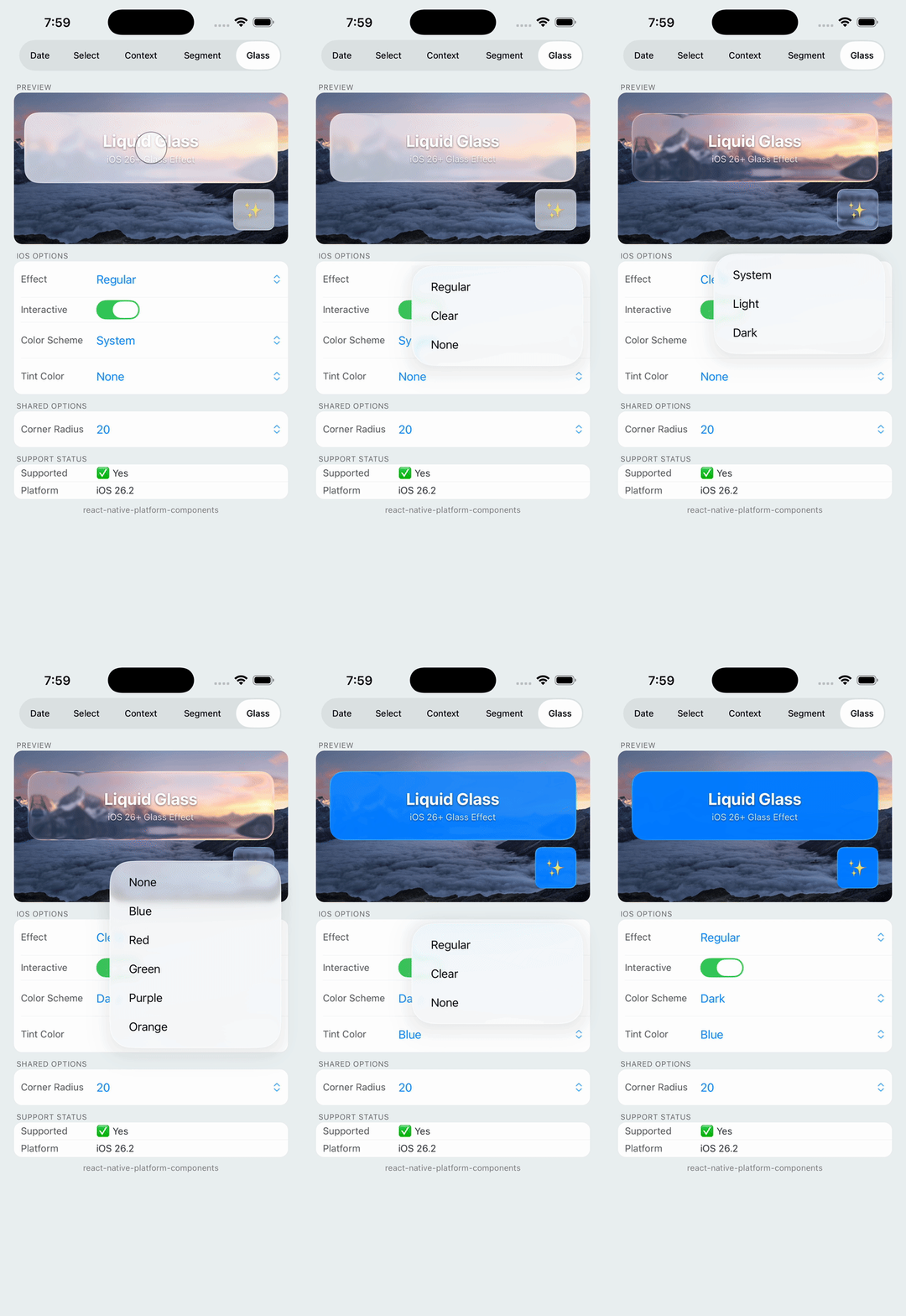 |
iOS 26+ only
On Android, renders as a
regular View with optional
fallback background color. |
Native glass morphism effect using UIGlassEffect on iOS 26+. On Android and older iOS versions, renders as a regular View with optional fallback styling.
Note: LiquidGlass requires iOS 26+ at runtime, and the library must be built with Xcode 26 (the iOS 26 SDK). Built with an older Xcode, the glass code is compiled out and the component falls back to a blur, so the library still builds without Xcode 26. On older iOS versions and on Android, the component renders children without the glass effect. Use isLiquidGlassSupported to check availability and provide fallback UI — it reports what the build can actually do, not just the OS version.
Props
| Prop | Type | Description |
|---|
cornerRadius | number | Corner radius for the glass effect (default: 0) |
children | ReactNode | Content to render inside the glass container |
iOS Props (ios)
| Prop | Type | Description |
|---|
effect | 'clear' | 'regular' | 'none' | Glass effect intensity (default: 'regular') |
interactive | boolean | Enable touch interaction feedback (default: false) |
tintColor | string | Overlay tint color (hex string) |
colorScheme | 'light' | 'dark' | 'system' | Appearance mode (default: 'system') |
Android Props (android)
| Prop | Type | Description |
|---|
fallbackBackgroundColor | string | Background color when glass effect unavailable |
Constants
| Export | Type | Description |
|---|
isLiquidGlassSupported | boolean | true on iOS 26+ when built with the iOS 26 SDK, false otherwise |
Effect Modes
'regular' (default): Standard glass blur intensity with full glass morphism effect'clear': More transparent, subtle glass effect'none': No glass effect (useful for animating materialization/dematerialization)
| Platform | iOS 26+ | iOS < 26 | Android |
|---|
| Glass Effect | Full glass morphism | No effect | No effect |
| Corner Radius | Applied | Applied | Applied |
| Tint Color | Supported | Ignored | Ignored |
| Interactive | Supported | Ignored | Ignored |
| Fallback BG | N/A | Transparent | Configurable |
Usage Tips
- Check support first: Use
isLiquidGlassSupported to conditionally render fallback UI
- Background content: Glass effects work best over images or colorful backgrounds
- Interactive mode: Only applies on mount; cannot be toggled after initial render
- Android fallback: Set
android.fallbackBackgroundColor for a semi-transparent background