Checkbox
| iOS | Android |
 |
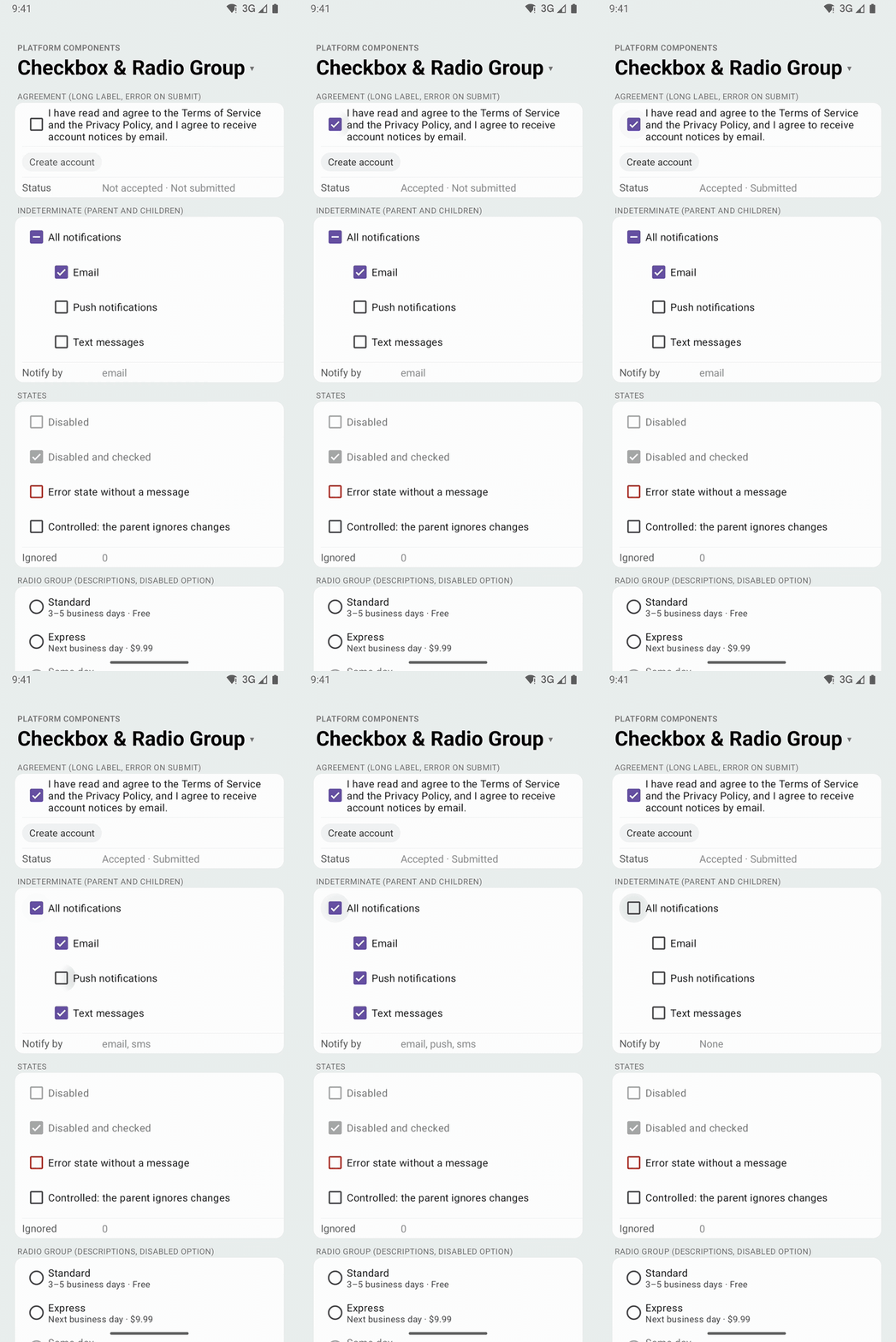 |
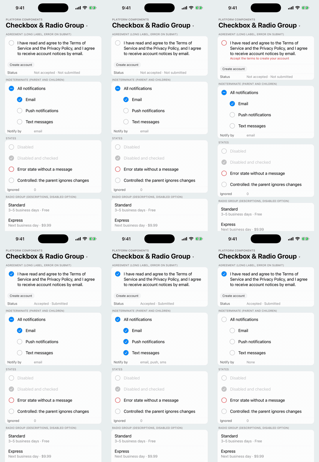
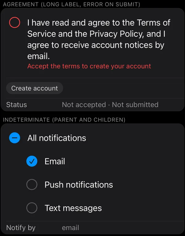
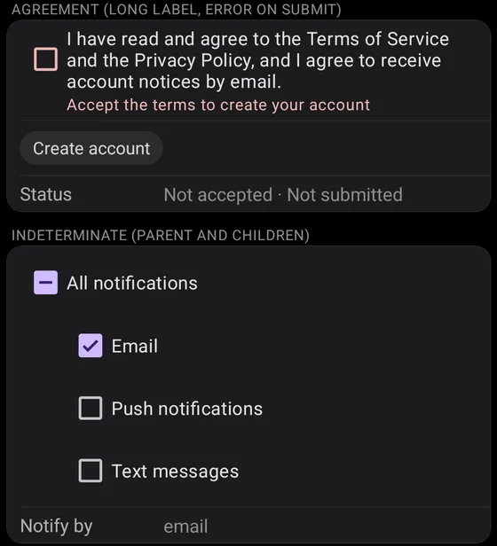
A checkbox with a label that wraps, for agreements ("I have read the …") and lists of options that can each be on or off. The box and the label are one touch target, and one element for screen readers and tests.
- Android: Material 3
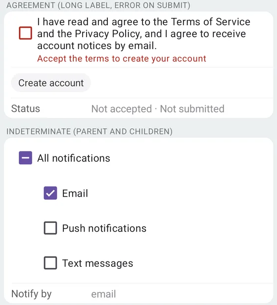
MaterialCheckBox, with the label as the widget's own text, in the app's Material theme.checked: 'indeterminate'is its indeterminate state, anderrorits error state (isErrorShown). - iOS: there is no system checkbox. The component draws the list idiom: a row with a leading
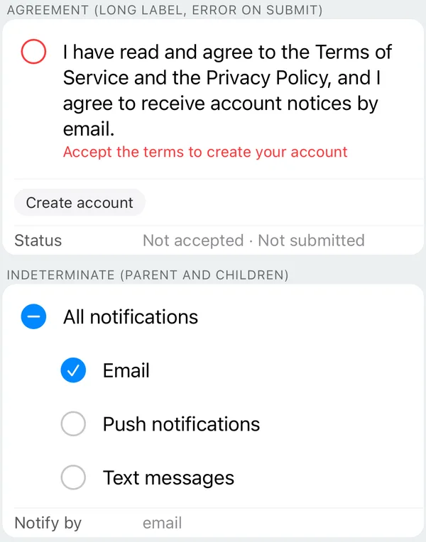
circlethat fills intocheckmark.circle.fillin the tint color when checked (minus.circle.fillwhen indeterminate), as in Reminders. The row highlights while pressed like a list cell. In the error state the symbol turns red and the message sits under the label. - Web: a native
<input type="checkbox">inside its<label>.
| iOS 26 | Android |
|---|---|
 |  |
 |  |
import { Checkbox } from 'react-native-platform-components';

const [accepted, setAccepted] = useState(false);
const [error, setError] = useState<string>();

<Checkbox
  label="I have read and agree to the Terms of Service and the Privacy Policy."
  checked={accepted}
  onCheckedChange={(checked) => {
    setAccepted(checked);
    if (checked) setError(undefined);
  }}
  error={error}
/>

<Button
  title="Create account"
  onPress={() => {
    if (!accepted) setError('Accept the terms to create your account');
  }}
/>
Props
| Prop | Type | Description |
|---|---|---|
checked | boolean | 'indeterminate' | The controlled state (required). See Controlled state and Indeterminate |
onCheckedChange | (checked: boolean) => void | Called when the user toggles the checkbox, with the state asked for: the opposite of checked, and true from 'indeterminate' |
label | string | Text beside the box. It wraps onto as many lines as it needs |
disabled | boolean | Disables the checkbox |
error | boolean | string | Error state. A string is also the message shown under the label. See Error |
haptics | 'selection' | 'light' | 'medium' | 'heavy' | 'success' | 'warning' | 'error' | 'none' | Haptic played when the user toggles the checkbox. See Haptics. Default: none |
maxFontSizeMultiplier | number | Largest scale the label may reach with the system text size (Dynamic Type / font scale), as on Text. Unset or 0: no cap |
accessibilityLabel | string | Screen-reader label. Defaults to label |
testID | string | Test identifier, on the element that carries the label, the state and the touches. See Testing |
Controlled state
checked is controlled, like React Native's Switch: a tap calls onCheckedChange, and the box shows the new state once checked changes. If the parent doesn't update it, the checkbox goes back. On Android the MaterialCheckBox toggles (with its animation) as soon as it is tapped and returns to checked once JavaScript has answered; on iOS the row shows only what checked says.
Indeterminate
checked: 'indeterminate' is the mixed state of a parent checkbox whose children are partly checked: Material's indeterminate box on Android, minus.circle.fill on iOS, the input's indeterminate flag on the web, and "mixed" for screen readers. A tap on an indeterminate checkbox asks for true, as on the other platforms.
const all =
  selected.length === channels.length
    ? true
    : selected.length === 0
      ? false
      : 'indeterminate';

<Checkbox
  label="All notifications"
  checked={all}
  onCheckedChange={(checked) => setSelected(checked ? channels : [])}
/>;
Error
error follows TextField's error: true shows the error look, and a string also shows that message. A string fits the usual form case, where the message says what is wrong ("Accept the terms to create your account") and appears only after a failed submit.
- Android: Material 3's error state (
isErrorShown), which draws the box in the theme'scolorError. The message goes under the label, lined up with its start, incolorErrorand Material's supporting-text style (Body Small). TalkBack reads it with the checkbox (errorAccessibilityLabel); witherror={true}it reads Material's localized "Error: invalid". - iOS: the symbol turns
systemRed, and the message sits under the label in red (footnote), inside the row. VoiceOver reads it after the checkbox's state.
Accessibility
The testID, the label and the touch target are one element, which carries the checkbox role and the checked state:
- Android: the
MaterialCheckBox, a checkable view that TalkBack announces as a checkbox, checked, not checked or partially checked. - iOS: the row. iOS has no checkbox trait, so, as React Native does for
accessibilityRole="checkbox", the row's accessibility value says it: "checkbox, checked", "checkbox, unchecked" or "checkbox, mixed", followed by the error message. These words are English, as React Native's are. - Web: the
<input type="checkbox">, witharia-invalidin the error state and the message as its description (aria-describedby).
The label follows Dynamic Type and the font scale (capped by maxFontSizeMultiplier), and the row lays out right to left in RTL languages.
iOS: Switch or Checkbox
For a single on/off setting that applies at once, such as "Notifications", iOS uses a switch: React Native's Switch is a UISwitch. Use Checkbox where a form asks the user to confirm or pick items before submitting, such as an agreement or a list of channels, which is where Material uses a checkbox too.
Testing
testID is what Detox's by.id matches, and that element has the label and takes the taps:
- iOS: the row's
accessibilityIdentifier; the host view carries none. - Android: the
MaterialCheckBox's view tag, and itsresource-idfor Maestro and Appium.
await expect(element(by.id('terms'))).toHaveLabel(
  'I have read and agree to the Terms of Service and the Privacy Policy.'
);
await element(by.id('terms')).tap();

// The state
if (device.getPlatform() === 'android') {
  await expect(element(by.id('terms'))).toHaveToggleValue(true);
} else {
  await expect(element(by.id('terms'))).toHaveValue('checkbox, checked');
}
In Jest, the mock renders a Pressable with the checkbox role, testID, the label and accessibilityState.checked ('mixed' when indeterminate).
Android theme
The checkbox is built from the app's Material theme, so it takes your colors (colorPrimary, colorError), and it follows useNativeTheme. With an AppCompat theme it falls back to Material 3 defaults and logs one warning, like the other Material components (see Android Theme Configuration).