FloatingActionButton
| iOS | Android |
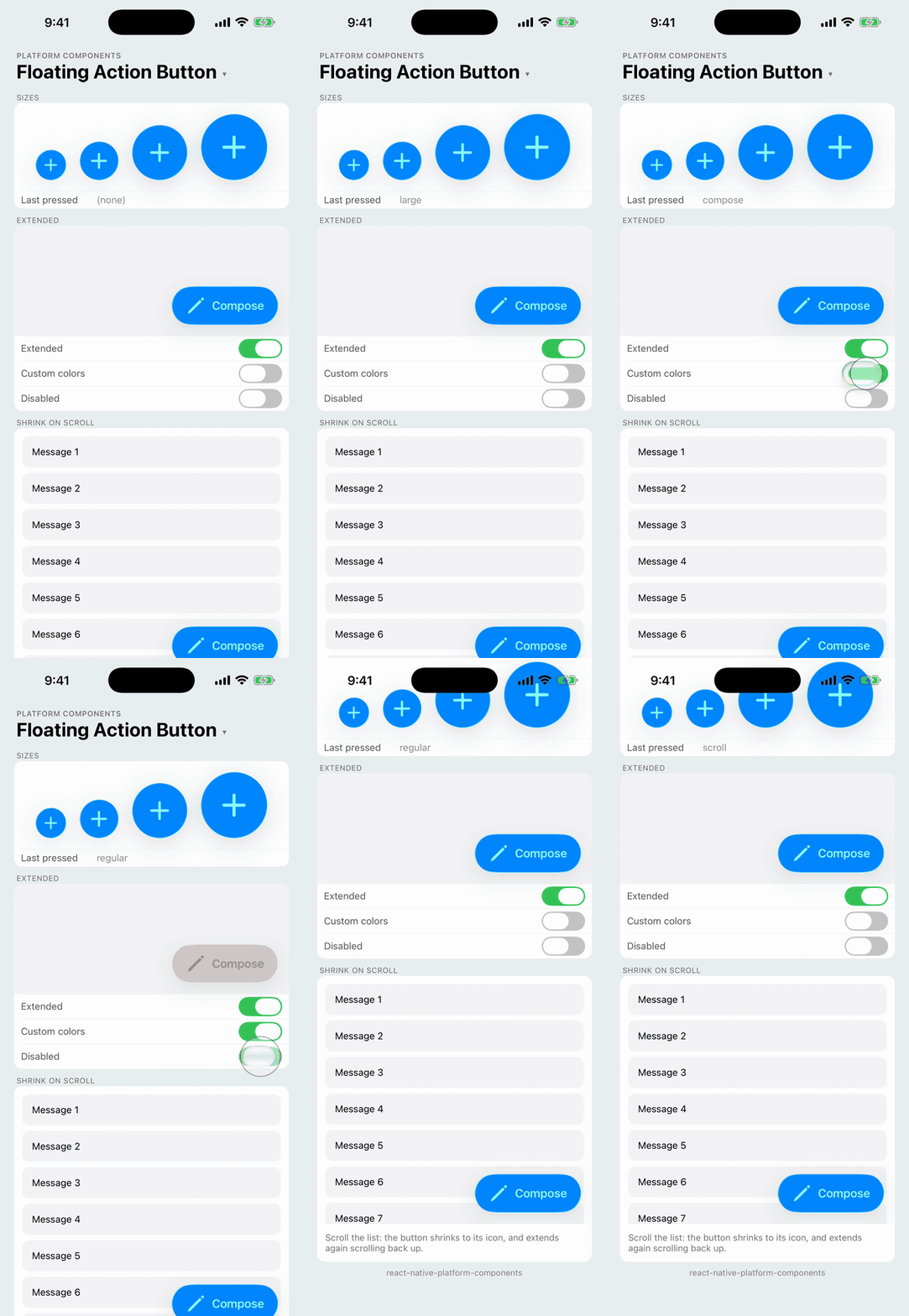 |
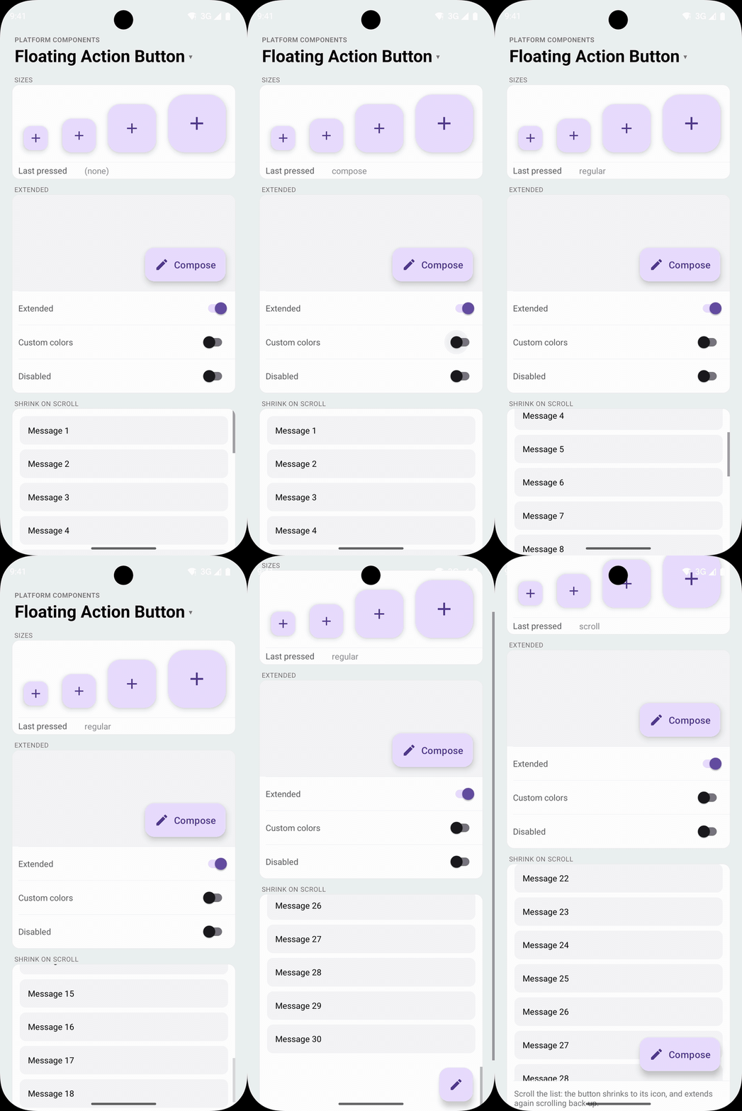 |
The Material floating action button (FAB): the screen's primary action, floating over the content. Android renders the real Material widgets, FloatingActionButton for an icon and ExtendedFloatingActionButton with a label, which shrinks to its icon and extends again with Material's own animation.
iOS has no floating action button. There, FloatingActionButton renders the system's prominent button in a round shape: a UIButton with the .prominentGlass() configuration on iOS 26 (Liquid Glass) and .filled() before, a circle with the icon, or a capsule with the icon and label. It is not a Material look-alike.
| iOS 26 | iOS 18 | Android |
|---|---|---|
 |  |  |
import { FloatingActionButton } from 'react-native-platform-components';

<FloatingActionButton
  icon={{ ios: 'pencil', android: 'edit' }}
  label="Compose"
  onPress={compose}
  style={{ position: 'absolute', right: 16, bottom: insets.bottom + 16 }}
/>
The button doesn't position itself on either platform: place it in your layout, usually absolutely at the bottom end of the screen, clear of the safe area (see Placement).
Props
| Prop | Type | Description |
|---|---|---|
icon | PlatformIcon | The icon. See Icons |
label | string | Label next to the icon: the extended FAB. Omit for an icon-only button |
extended | boolean | Whether a button with a label shows it. Changing it animates. See Extended. Default: true |
size | 'small' | 'regular' | 'medium' | 'large' | Size. See Sizes. Default: 'regular' |
color | ColorValue | Container color. See Colors |
tintColor | ColorValue | Icon and label color |
disabled | boolean | Disables the button |
accessibilityLabel | string | Screen-reader label. Defaults to label; give icon-only buttons one |
haptics | 'selection' | 'light' | 'medium' | 'heavy' | 'success' | 'warning' | 'error' | 'none' | Haptic played when the button is pressed. See Haptics. Default: none |
onPress | () => void | Called when the button is pressed |
scrollViewNativeID | string | The nativeID of a ScrollView or FlatList whose scrolling shrinks and extends the button. See Shrink on scroll |
testID | string | Test identifier |
Sizes
size | Android FAB | Android extended FAB | iOS |
|---|---|---|---|
'small' | 40dp small FAB (in a 48dp touch target) | 56dp small extended | 44pt circle |
'regular' (default) | 56dp FAB | 56dp small extended | 56pt circle |
'medium' | 80dp medium FAB | 80dp medium extended | 80pt circle |
'large' | 96dp large FAB | 96dp large extended | 96pt circle |
Android uses the theme's FAB styles for each size (floatingActionButtonSmallStyle, floatingActionButtonStyle, floatingActionButtonMediumStyle, floatingActionButtonLargeStyle and the three extended styles), so a Material 3 Expressive app theme gets the Expressive FABs and a customized FAB style carries over. Material 3 Expressive drops the small FAB in favor of the medium one; small is the Material 3 small FAB. Extended FABs come in three sizes, so small and regular both use the 56dp one.
On iOS the button is a circle of the size's diameter (the small one keeps the 44pt minimum touch target), and extended, a capsule of the same height. The SF Symbol and the label scale with the size.
| iOS 26 | iOS 18 | Android |
|---|---|---|
 |  |  |
Extended
A button with a label is the extended FAB. extended={false} shrinks it to its icon, and true extends it again:
- Android:
ExtendedFloatingActionButton.shrink()andextend(), Material's animation. The shrunk button is the FAB of the same size. - iOS: the capsule animates to a circle and back.
The button sits at the end (right, in left-to-right layouts) of its view and shrinks toward that edge, and the view keeps the extended width until the button has shrunk. Anchor the button by its end edge (right or end), as Material places a FAB, so it doesn't jump.
The label stays the button's accessibility label while shrunk.
Shrink on scroll
Pass the nativeID of the ScrollView (or FlatList) the button floats over as scrollViewNativeID: an extended button shrinks to its icon while the content scrolls down, and extends again scrolling up, and always at the top of the content. There's no scroll handler to write; the native view follows the scroll view's offset.
Setting scrollViewNativeID turns the behavior on. It only applies to a button with a label, and extended={false} keeps the button shrunk regardless of scrolling. It works alongside a TabBar that follows the same ScrollView.
<View style={{ flex: 1 }}>
  <FlatList nativeID="inbox" data={messages} renderItem={renderMessage} />
  <FloatingActionButton
    icon={{ ios: 'pencil', android: 'edit' }}
    label="Compose"
    scrollViewNativeID="inbox"
    onPress={compose}
    style={{ position: 'absolute', right: 16, bottom: insets.bottom + 16 }}
  />
</View>
| iOS 26 | Android | |
|---|---|---|
| At the top |  |  |
| Scrolled down |  |  |
A ScrollView nested in another vertical ScrollView needs nestedScrollEnabled on Android to scroll at all.
Colors
The button takes the Material colors on Android (the primary container, with the "on" color for the icon and label), including a brand color set with useNativeTheme, and the tint color on iOS. color and tintColor override them:
- Android:
coloris thebackgroundTintandtintColorthe icon tint and text color. The disabled colors stay Material's. - iOS:
coloris the configuration'sbaseBackgroundColor, which tints the prominent glass on iOS 26, andtintColoritsbaseForegroundColor. The iOS 26 prominent glass draws the icon and label with its own vibrancy, a light tint over the container color with a lighter rim rather than plain white, as it does for a Button withvariant="prominentGlass".
| iOS 26 | Android |
|---|---|
 |  |
<FloatingActionButton icon="plus" label="New" color="#FF6B35" tintColor="#FFFFFF" onPress={add} />
Placement
The button is a view in your layout that takes its own size. Material floats the FAB 16dp from the bottom and end edges of the screen, above any bottom bar; do the same with absolute positioning and add the bottom safe-area inset, for example with react-native-safe-area-context:
const insets = useSafeAreaInsets();

<View style={{ flex: 1 }}>
  <Content />
  <FloatingActionButton
    icon="plus"
    accessibilityLabel="New message"
    onPress={compose}
    style={{ position: 'absolute', right: 16 + insets.right, bottom: 16 + insets.bottom }}
  />
</View>
On iOS, Apple's apps put the primary action in the navigation bar or toolbar rather than a floating button. FloatingActionButton gives a cross-platform screen the same action in the same place; if an iOS screen already has a toolbar, a Button there may fit better.
Not included
- The Material 3 Expressive FAB menu. The FAB that opens a list of related actions is only in Jetpack Compose (
FloatingActionButtonMenu); Material Components for Android 1.14.0, the View library this component uses, doesn't have it. - Hiding the button (
hide()/show()). Render it conditionally instead; on scroll,scrollViewNativeIDshrinks an extended button.
Testing
testID is on the button's view: tap it with element(by.id(...)). The Jest mock renders a Pressable with the button role, labeled by accessibilityLabel or label.
Android theme
The FAB is a Material widget, so it works with a Theme.Material3 app theme and with the library's Material 3 fallback; see Android Theme Configuration.