TabBar
| iOS | Android |
 |
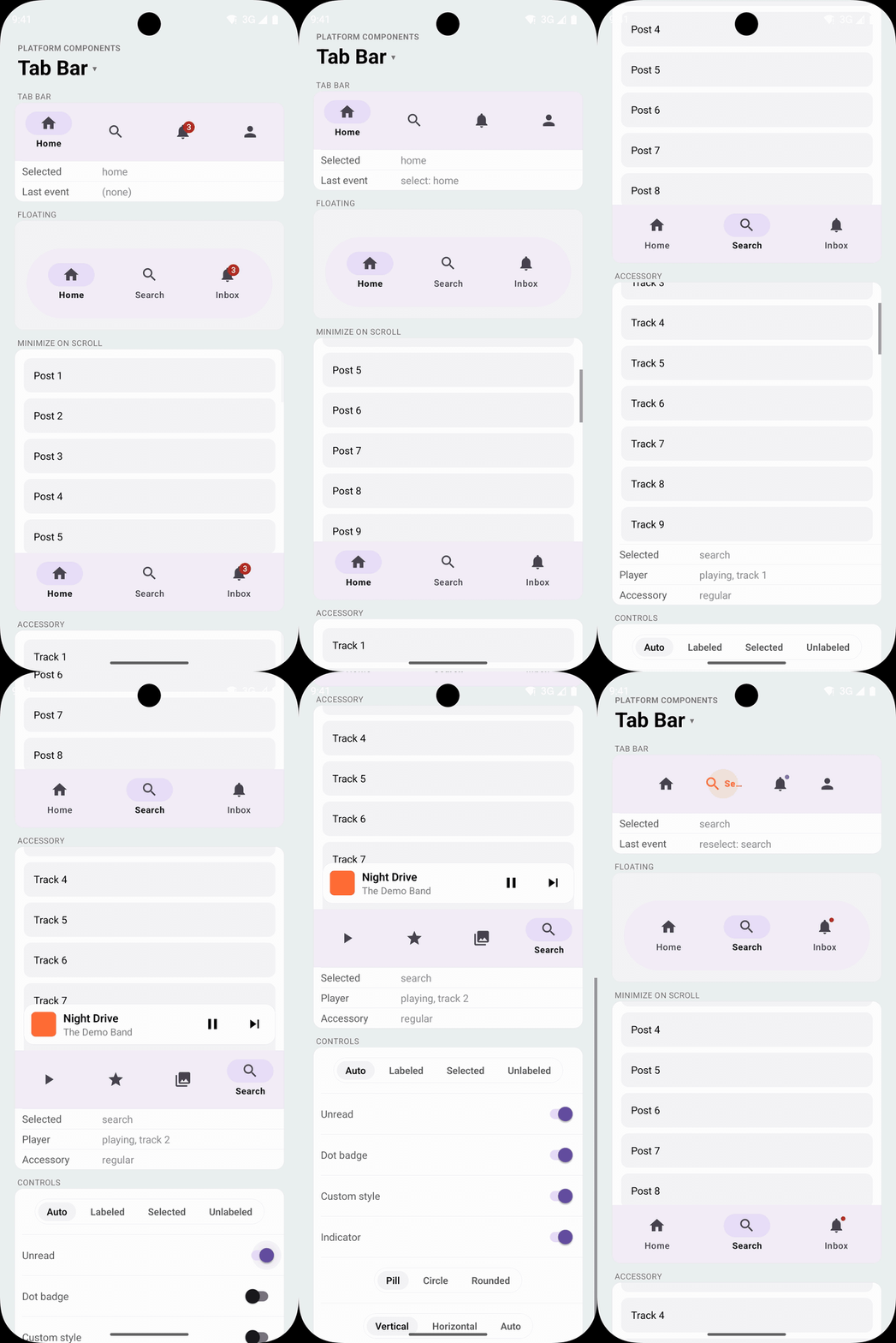 |
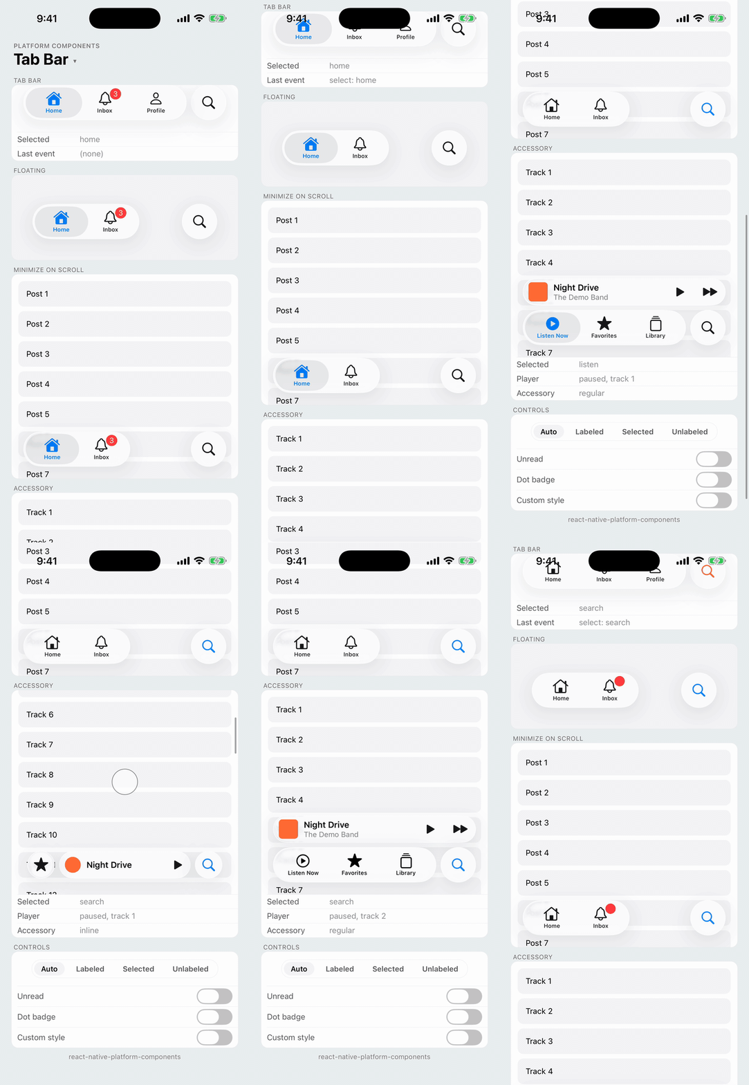
The platform tab bar: UITabBar on iOS and the Material 3 navigation bar (BottomNavigationView) on Android. Each tab has an icon over a label and an optional badge. On iOS 26 the bar is the floating Liquid Glass bar with its glass selection; earlier iOS shows the classic bar, and Android the Material bar with the active indicator pill.
TabBar draws the bar and reports presses; it doesn't manage screens. Render the selected screen yourself, or pass the bar to your navigation library as a custom tab bar (see With React Navigation).
import { TabBar } from 'react-native-platform-components';

const [tab, setTab] = useState('home');

<TabBar
  items={[
    { label: 'Home', value: 'home', icon: { ios: 'house', android: 'home' }, selectedIcon: { ios: 'house.fill' } },
    { label: 'Search', value: 'search', icon: { ios: 'magnifyingglass', android: 'search' } },
    { label: 'Inbox', value: 'inbox', icon: { ios: 'bell', android: 'notifications' }, badge: unread || undefined },
  ]}
  selectedValue={tab}
  onSelect={setTab}
  onReselect={scrollToTop}
/>
Props
| Prop | Type | Description |
|---|---|---|
items | TabBarItem[] | The tabs, at most five. See TabBarItem |
selectedValue | string | null | The selected tab's value; null for none |
haptics | 'selection' | 'light' | 'medium' | 'heavy' | 'success' | 'warning' | 'error' | 'none' | Haptic played when the user presses a tab, a reselect included. See Haptics. Default: none |
onSelect | (value: string, index: number) => void | A tab was pressed |
onReselect | (value: string, index: number) => void | The selected tab was pressed again, the usual "scroll to top" or "back to root" gesture |
labelVisibility | 'auto' | 'labeled' | 'selected' | 'unlabeled' | How labels show. See Labels. Default: 'auto' |
activeTintColor | ColorValue | Icon and label color of the selected tab |
inactiveTintColor | ColorValue | Icon and label color of the other tabs |
barColor | ColorValue | Bar background. See Styling |
badgeStyle | { backgroundColor?, color? } | Badge colors |
labelStyle | { fontFamily?, fontSize?, fontWeight?, fontStyle? } | Label font |
minimizeBehavior | 'automatic' | 'never' | 'onScrollDown' | 'onScrollUp' | Gets the bar out of the way as the content scrolls. See Minimize on scroll |
scrollViewNativeID | string | The nativeID of the ScrollView or FlatList that drives minimizeBehavior |
accessory | ReactNode | A view carried with the bar, such as a mini player. See Bottom accessory |
onAccessoryEnvironmentChange | (environment: 'regular' | 'inline') => void | iOS 26: the accessory moved into its row above the bar ('regular') or beside the minimized bar ('inline') |
maxFontSizeMultiplier | number | Cap on the label font scale, as on Text. Android only; iOS tab labels have a fixed size |
testID | string | Test identifier of the bar |
TabBarItem
| Prop | Type | Description |
|---|---|---|
label | string | Tab label |
value | string | Unique value returned in callbacks |
icon | PlatformIcon | Tab icon. See Icons |
selectedIcon | PlatformIcon | Icon of the selected tab, such as the filled SF Symbol (house.fill). Defaults to icon |
badge | string | number | Badge text or count; '' shows a dot; undefined hides it |
disabled | boolean | The tab can't be selected |
accessibilityLabel | string | Screen-reader label. Defaults to label; the badge is announced after it |
testID | string | Test identifier of the tab. See Testing |
role | 'search' | The search tab. See Search tab and system items |
systemItem | TabBarSystemItem | iOS: a system tab item with the system's title and icon. See Search tab and system items |
Android Props (android)
| Prop | Type | Description |
|---|---|---|
indicatorColor | ColorValue | The active indicator pill behind the selected icon |
rippleColor | ColorValue | Ripple shown while pressing a tab |
indicator | boolean | Whether the selected tab shows the active indicator. Default: true |
indicatorShape | 'pill' | 'circle' | number | The indicator's shape; a number is a corner radius in dp. Default: 'pill' |
indicatorWidth | number | Indicator width in dp. Default: the Material width (64) |
indicatorHeight | number | Indicator height in dp. Default: the Material height (32) |
itemLayout | 'vertical' | 'horizontal' | 'auto' | Icon above or beside the label. Default: 'vertical'. See Active indicator and horizontal tabs |
Selection
The bar is controlled: it shows the tab whose value is selectedValue. A press calls onSelect and the bar keeps its selection until selectedValue changes, so a press you ignore (a tab that needs sign-in first, say) leaves the selection where it was. Pressing the selected tab calls onReselect instead.
Labels
labelVisibility | iOS | Android |
|---|---|---|
'auto' (default) | Every tab labeled | Every tab labeled up to three tabs, the selected one from four |
'labeled' | Every tab labeled | Every tab labeled |
'selected' | Every tab labeled | Only the selected tab |
'unlabeled' | Icons only | Icons only |
Screen readers announce the label in every mode.
Badges
badge takes a count or short text, shown in the platform's badge: red on iOS, the Material error color on Android. An empty string is a dot, for "something new" without a count. badgeStyle recolors them.
{ label: 'Inbox', value: 'inbox', icon: 'bell', badge: unread > 0 ? unread : undefined }
{ label: 'Updates', value: 'updates', icon: 'sparkles', badge: '' } // a dot
Search tab and system items
role: 'search' makes a tab the app's search tab. On iOS it is the system search item, with the magnifying glass and the localized "Search" title; iOS 26 sets it apart from the other tabs as its own glass circle at the end of the bar, wherever it is in items. Android has no search tab: it's a regular tab with a search icon (your icon if you set one). Selecting it goes through onSelect like any other tab, and it's up to you what it shows.
| iOS 26 | iOS 18 | Android |
|---|---|---|
 |  |  |
items={[
  { label: 'Home', value: 'home', icon: { ios: 'house', android: 'home' } },
  { label: 'Inbox', value: 'inbox', icon: { ios: 'bell', android: 'notifications' } },
  { label: 'Search', value: 'search', role: 'search' },
]}
systemItem gives an iOS tab one of UIKit's system items (UITabBarItem.SystemItem), with the system's localized title and icon: 'bookmarks', 'contacts', 'downloads', 'favorites', 'featured', 'history', 'more', 'mostRecent', 'mostViewed', 'recents', 'search' or 'topRated'. The system decides both, so label and icon only apply on Android (and web), where there are no system items. systemItem: 'search' is the same tab as role: 'search' on iOS.
{ label: 'Favorites', value: 'favorites', systemItem: 'favorites', icon: { android: 'star' } }
A system item's title follows your app's localizations, as the system apps' do. For a search tab with your own title, use a regular tab with a magnifying glass icon instead.
Styling
The bar takes the tint color on iOS and the Material 3 colors on Android, including a brand color set with useNativeTheme. activeTintColor and inactiveTintColor override the tab colors, android.indicatorColor the pill.
barColor replaces the bar background: the system chrome on iOS before 26, the Material surface container on Android. 'transparent' puts the bar on your own background. On iOS 26 the bar is always its floating Liquid Glass capsule; barColor doesn't replace the glass.
Active indicator and horizontal tabs (Android)
The Material 3 bar marks the selected tab with the active indicator, a pill behind its icon. android.indicator: false turns it off, leaving the selected tab to its color. android.indicatorShape reshapes it: 'pill' (the default, fully rounded ends), 'circle' (a circle the indicator's height across) or a number, the corner radius in dp of a rounded rectangle. indicatorWidth and indicatorHeight size it in dp; the bar keeps its 80dp height, so an indicator taller than the default 32dp crowds the label.
android.itemLayout: 'horizontal' puts each icon beside its label, the Material 3 Expressive layout for wide bars; its indicator wraps the icon and label. 'auto' picks horizontal when the bar is at least 600dp wide (a tablet, or a phone in landscape) and vertical below that.
| No indicator | Circle indicator | Horizontal tabs ('auto', landscape) |
|---|---|---|
 |  |  |
<TabBar
  items={items}
  selectedValue={tab}
  onSelect={setTab}
  android={{ indicatorShape: 'circle', itemLayout: 'auto' }}
/>
iOS has no equivalent settings: its selection look is the system's.
Floating tabs
On iOS 26 the tab bar floats by itself: a Liquid Glass capsule over your content, with room around it. On earlier iOS and on Android, put a transparent bar in a FloatingToolbar for the same layout:
import { FloatingToolbar, TabBar, isLiquidGlassSupported } from 'react-native-platform-components';

const bar = <TabBar items={items} selectedValue={tab} onSelect={setTab} barColor="transparent" style={{ flex: 1 }} />;

{isLiquidGlassSupported ? bar : <FloatingToolbar style={{ alignSelf: 'stretch' }}>{bar}</FloatingToolbar>}
Minimize on scroll
minimizeBehavior gets the bar out of the way while the content scrolls, following the ScrollView (or FlatList) whose nativeID you pass as scrollViewNativeID. There's no scroll handler to write: the platform tracks the scrolling.
- iOS 26: the system tab bar minimization. The bar shrinks into a small glass capsule showing the selected tab, and expands again as the content scrolls back. This is
UITabBarController.tabBarMinimizeBehavior: with aminimizeBehavior,TabBarhosts its bar in a tab bar controller and hands it your ScrollView as the content scroll view. - Android: the Material behavior for a bottom bar, the bar sliding off the bottom edge and back (
HideBottomViewOnScrollBehavior's motion). The bar always shows at the top of the content. - iOS before 26: the bar stays; the system has no minimized tab bar.
| Value | Behavior |
|---|---|
'onScrollDown' | Minimize (Android: hide) while scrolling down, restore scrolling up |
'onScrollUp' | The reverse |
'automatic' | The platform default: iOS decides; Android hides on scroll down |
'never' | Always full size |
<View style={{ flex: 1 }}>
  <FlatList nativeID="feed" data={posts} renderItem={renderPost} />
  <View style={{ position: 'absolute', left: 0, right: 0, bottom: insets.bottom }}>
    <TabBar
      items={items}
      selectedValue={tab}
      onSelect={setTab}
      minimizeBehavior="onScrollDown"
      scrollViewNativeID="feed"
    />
  </View>
</View>
The Android bar slides down by its own height; place it at the bottom edge, or inside a view with overflow: 'hidden', so it leaves the screen rather than covering content below it. A ScrollView nested in another vertical ScrollView needs nestedScrollEnabled on Android to scroll at all.
Bottom accessory
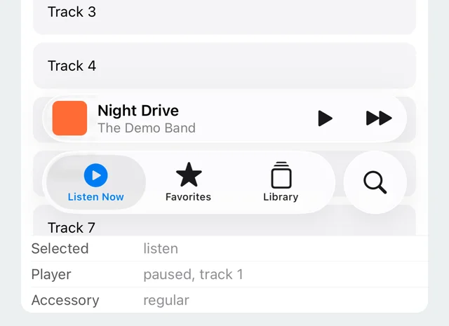
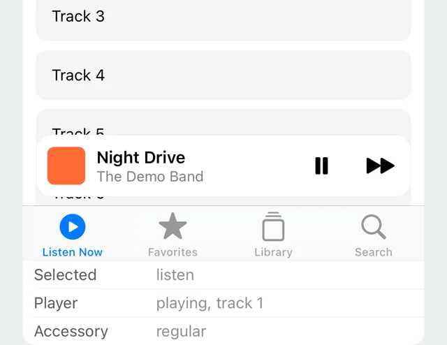
accessory puts a view of yours on the bar, such as the mini player of a music app.
- iOS 26: the tab bar's bottom accessory (
UITabBarController.bottomAccessory, aUITabAccessory). The system draws it as a glass row above the bar, and while the bar is minimized (see Minimize on scroll) it moves inline, beside the minimized tab. Your view is laid out at the accessory's size and follows it as it changes;onAccessoryEnvironmentChangereports the move ('inline', then'regular'again), so you can switch to a compact layout. - Android and iOS before 26: a plain view above the bar. There's no system accessory, so your view draws its own background. On Android it slides away together with the bar under
minimizeBehavior.
The bar's height includes the accessory's row, so place it as you would the bar alone. The accessory is a regular React view: presses, testIDs and state work as anywhere else.
| iOS 26 | iOS 26, minimized | iOS 18 | Android |
|---|---|---|---|
 |  |  |  |
const [environment, setEnvironment] = useState<TabBarAccessoryEnvironment>('regular');

<TabBar
  items={items}
  selectedValue={tab}
  onSelect={setTab}
  minimizeBehavior="onScrollDown"
  scrollViewNativeID="library"
  accessory={
    <MiniPlayer
      compact={environment === 'inline'}
      style={isLiquidGlassSupported ? undefined : styles.playerCard}
    />
  }
  onAccessoryEnvironmentChange={setEnvironment}
/>
On iOS 26 the accessory content is hosted by UIKit and your view sits inside the system's glass capsule, so give it no background of its own there (isLiquidGlassSupported tells the two apart). The row is 48pt tall; lay the content out with flexbox rather than fixed widths, since the inline accessory is narrower.
Placement and safe areas
The bar is a view in your layout: it fills the width it's given and takes the height the platform wants for it (49pt on iOS before 26, 83pt with the iOS 26 floating spacing, 80dp on Android), plus the accessory's row when it has one. It doesn't pad itself for the home indicator or the Android navigation bar; at the bottom of the screen, add the bottom inset around it, for example with react-native-safe-area-context:
const insets = useSafeAreaInsets();

<View style={{ paddingBottom: insets.bottom }}>
  <TabBar items={items} selectedValue={tab} onSelect={setTab} />
</View>
Phones show at most five tabs; TabBar keeps the first five and warns in development.
With React Navigation
A bottom-tab navigator takes a custom tab bar through its tabBar option:
<Tab.Navigator
  tabBar={({ state, navigation, descriptors }) => (
    <TabBar
      items={state.routes.map((route) => ({
        label: descriptors[route.key].options.title ?? route.name,
        value: route.key,
        icon: ICONS[route.name],
      }))}
      selectedValue={state.routes[state.index].key}
      onSelect={(key) => {
        const route = state.routes.find((r) => r.key === key)!;
        navigation.navigate(route.name);
      }}
      onReselect={(key) => navigation.emit({ type: 'tabPress', target: key, canPreventDefault: true })}
    />
  )}
>
Testing
A tab's testID goes on the tab itself: the tab button on iOS (the circle, for the iOS 26 search tab), the navigation bar item on Android. E2E tests tap a tab by id:
await element(by.id('tab-inbox')).tap();
Android theme
The bar is a Material 3 widget, so it works with a Theme.Material3 app theme and with the library's Material 3 fallback; see Android Theme Configuration.