RadioGroup
| iOS | Android |
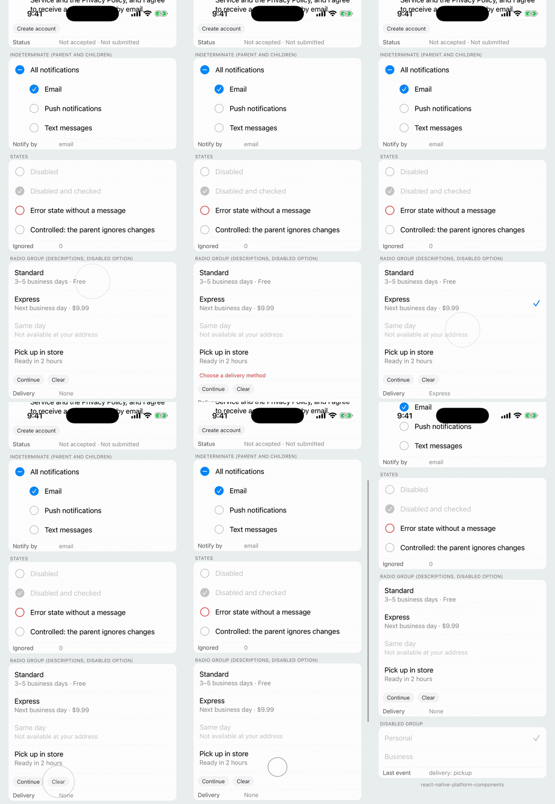 |
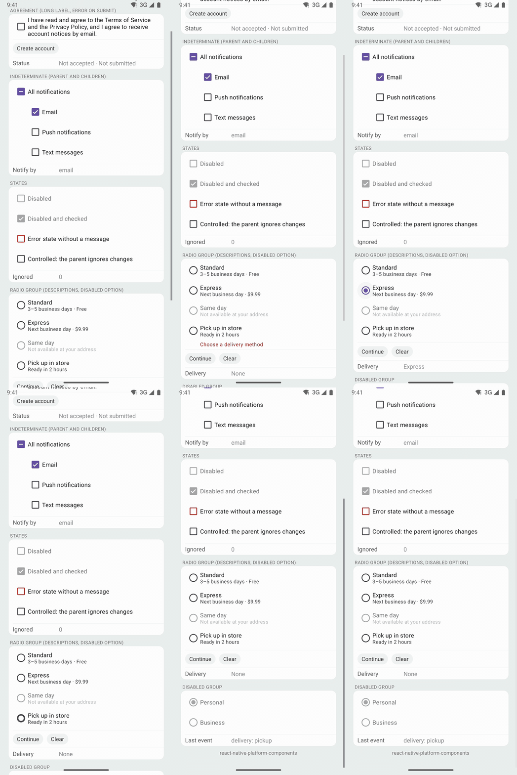 |
A single choice from a short list, such as an account type or a delivery method, with an optional description under each option and a validation message under the group.
- Android: Material 3
MaterialRadioButtons in an AndroidRadioGroup, in the app's Material theme. Each option is one radio button whose text is the label and, under it, the description. - iOS: there is no system radio button. The component draws the list idiom of Settings (a table cell's checkmark accessory): rows separated by hairlines, with a trailing
checkmarkin the tint color on the chosen row. Rows highlight while pressed like list cells. - Web: native
<input type="radio">s sharing one name, in aradiogroup.
| iOS 26 | Android |
|---|---|
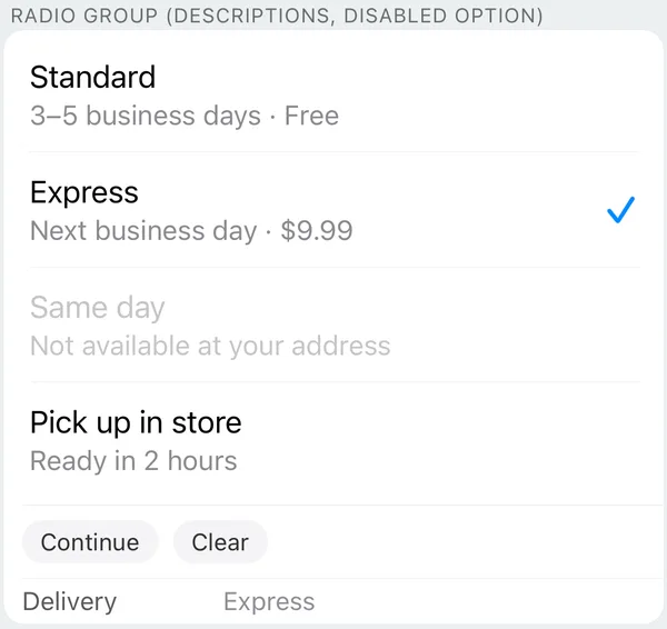 | 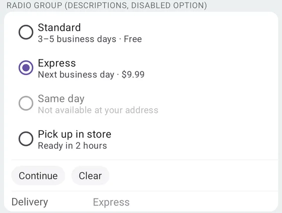 |
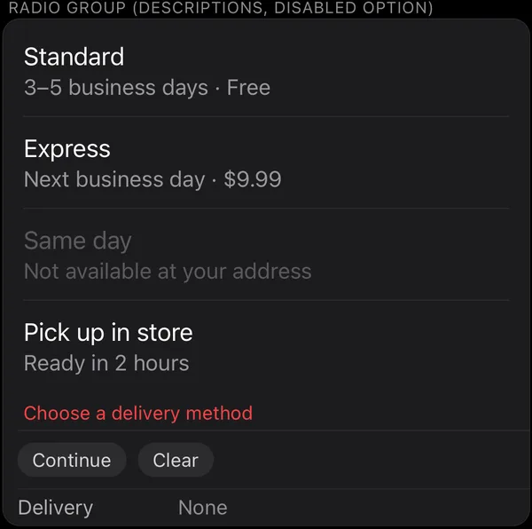 | 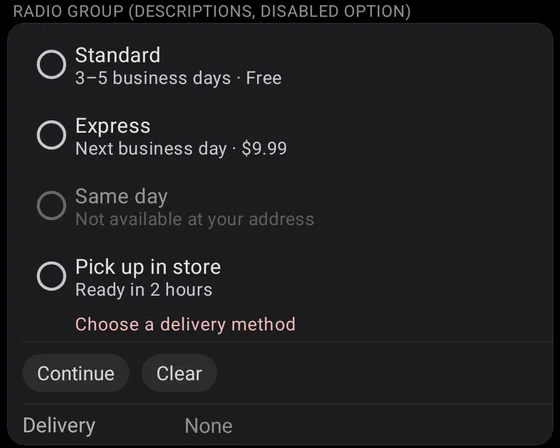 |
import { RadioGroup } from 'react-native-platform-components';

const [delivery, setDelivery] = useState<string | null>(null);
const [error, setError] = useState<string>();

<RadioGroup
  accessibilityLabel="Delivery method"
  options={[
    { value: 'standard', label: 'Standard', description: '3–5 business days · Free' },
    { value: 'express', label: 'Express', description: 'Next business day · $9.99' },
    { value: 'sameDay', label: 'Same day', description: 'Not available at your address', disabled: true },
    { value: 'pickup', label: 'Pick up in store', description: 'Ready in 2 hours' },
  ]}
  value={delivery}
  onValueChange={(value) => {
    setDelivery(value);
    setError(undefined);
  }}
  error={error}
/>

<Button
  title="Continue"
  onPress={() => {
    if (!delivery) setError('Choose a delivery method');
  }}
/>
Props
| Prop | Type | Description |
|---|---|---|
options | RadioGroupOption[] | Options, top to bottom. See RadioGroupOption |
value | string | null | Value of the chosen option (controlled). null / unset: none chosen yet. See Controlled value |
onValueChange | (value: string, index: number) => void | Called when the user picks an option |
error | boolean | string | Error state. A string is the validation message shown under the group. See Validation message |
disabled | boolean | Disables every option |
haptics | 'selection' | 'light' | 'medium' | 'heavy' | 'success' | 'warning' | 'error' | 'none' | Haptic played when the user picks an option. See Haptics. Default: none |
maxFontSizeMultiplier | number | Largest scale the labels may reach with the system text size (Dynamic Type / font scale), as on Text. Unset or 0: no cap |
accessibilityLabel | string | Screen-reader name of the group, such as "Delivery method". See Accessibility |
testID | string | Test identifier of the group, and the prefix of the options' default test IDs |
RadioGroupOption
The option shape follows ChipGroup's items.
| Property | Type | Description |
|---|---|---|
value | string | Unique value returned in callbacks |
label | string | Option text. It wraps |
description | string | Secondary text under the label, such as "3–5 business days" |
disabled | boolean | Disables this option |
testID | string | Test identifier of the option. Default: `${testID}-${value}` |
accessibilityLabel | string | Screen-reader label. Defaults to label |
Controlled value
value is controlled: a tap calls onValueChange, and the choice moves once value changes. If the parent doesn't update it, the choice goes back. On Android the RadioGroup checks the tapped option at once (with Material's animation) and returns to value once JavaScript has answered; on iOS the checkmark moves only when value does. Tapping the chosen option again does nothing, as with a native radio group. To clear the choice, set value to null.
Validation message
error follows TextField's error: a string is the message shown under the group, such as "Choose a delivery method", and true shows the error look without one.
- Android: the message, lined up with the labels, in the theme's
colorErrorand Material's supporting-text style (Body Small). TalkBack announces it when it appears (a polite live region). Material has no error state for radio buttons, so they keep their colors. - iOS: the message under the last row in red (footnote), and the checkmark turns red. VoiceOver reaches the message after the options.
- Web: the message is the group's description (
aria-describedby) and a polite live region, and the group hasaria-invalid.
Accessibility
Each option's testID, label and touch target are one element, which carries the radio role and the checked state, and the group has radio-group semantics where the platform has them:
- Android: each option is a
MaterialRadioButton(TalkBack: "radio button, checked / not checked"), in an AndroidRadioGroup, whose accessibility node reports the group (android.widget.RadioGroup).accessibilityLabelnames the group on Android 14+ (AccessibilityNodeInfo.setContainerTitle, like a fieldset's legend). TalkBack reads a description after the label, as the option's hint. - iOS: each option is a row. iOS has no radio button trait, so, as React Native does for
accessibilityRole="radio", the row's accessibility value says it: the description, then "radio button, checked" or "radio button, unchecked". These words are English, as React Native's are. The group is a semantic group (accessibilityContainerType), which VoiceOver names withaccessibilityLabelwhen it moves into it. - Web: a
role="radiogroup"labeled byaccessibilityLabel, around native radio inputs.
The labels follow Dynamic Type and the font scale (capped by maxFontSizeMultiplier), and the rows lay out right to left in RTL languages.
Testing
Each option's testID (by default `${testID}-${value}`) is what Detox's by.id matches:
- iOS: the row's
accessibilityIdentifier. The group'stestIDis on the host view. - Android: the
MaterialRadioButton's view tag, and itsresource-idfor Maestro and Appium.
await expect(element(by.id('delivery-express'))).toHaveLabel('Express');
await element(by.id('delivery-express')).tap();

if (device.getPlatform() === 'android') {
  await expect(element(by.id('delivery-express'))).toHaveToggleValue(true);
} else {
  await expect(element(by.id('delivery-express'))).toHaveValue(
    'Next business day · $9.99, radio button, checked'
  );
}
In Jest, the mock renders a view with the radiogroup role and a Pressable per option with the radio role, its testID and accessibilityState.checked.
Android theme
The radio buttons are built from the app's Material theme, so they take your colors, and they follow useNativeTheme. With an AppCompat theme they fall back to Material 3 defaults and log one warning (see Android Theme Configuration).